
Streamlining Content Discovery

Overview
Tenderfoot TV is a podcast production studio with a growing catalog of shows and a premium subscription offering. Their existing navigation and footer lacked clear hierarchy, creating friction for listeners trying to find content and burying key business initiatives like Tenderfoot+ in the process.
I led a focused redesign of the navigation and footer to bring structure to a cluttered experience — improving content discovery, elevating conversion touchpoints, and building patterns flexible enough to scale with the brand across desktop and mobile.
Role
UX Designer & Graphic Designer
Team
Copywriter, Developer, Creative Director
Responsibilities
- Audited existing navigation and footer for hierarchy, redundancy, and usability issues
- Restructured information architecture based on client priorities and content hierarchy to improve show and subscription discoverability
- Designed responsive navigation and footer patterns across desktop and mobile
- Maintained branding while improving accessibility and visual scanability
User Problem
A TenderfootTV listener is a content-focused true crime enthusiast who needs a consistent, hierarchical navigation system across all devices because fragmented menus and mismatched links between desktop and mobile made it difficult to discover new shows and understand the benefits of Tenderfoot+.
Business Problem
TenderfootTV is a growing podcast studio that needs a scalable, conversion-driven navigation architecture because a fragmented header and passive footer made it harder to surface premium subscription offerings and establish brand authority as the show library expanded.
- Research & Discovery -
Gathering Insights & User Pain Points
Research for this project was grounded in a client discovery session and an audit of the existing interface, evaluating it against core usability principles to identify structural gaps, hierarchy issues, and missed conversion opportunities.
Inconsistent Navigation Patterns
A cross-device audit revealed that links present in the desktop header were absent from the footer and mobile menu, giving users no reliable structure to depend on regardless of how they accessed the site.
Buried Premium Content
The client identified that Tenderfoot+ (their primary revenue driver) had no dedicated or prominent placement in the navigation. High-value conversion touchpoints were competing with general content at the same visual hierarchy level.
Flat Information Architecture
The existing footer functioned as an unstructured link dump rather than a navigational aid. Without categorical grouping or visual hierarchy, users had no clear mental model of the site's content offering.
How Might We...
-
How might we reduce cognitive load in the primary navigation while preserving access to all content?
-
How might we use the footer to support discovery, retention, and conversion?
-
How might we design a system that scales as shows and offerings grow?
- Final Design -
The Revised Design
Multiple navigation groupings and footer layouts were explored before landing on a structure that prioritized scanability, responsiveness, and alignment with Tenderfoot's content hierarchy.
Clear Navigation Hierarchy
Primary links are consolidated into six clear pillars (including a dedicated Tenderfoot+ entry point) reducing the split-row layout to a single, scannable bar that works across screen sizes.
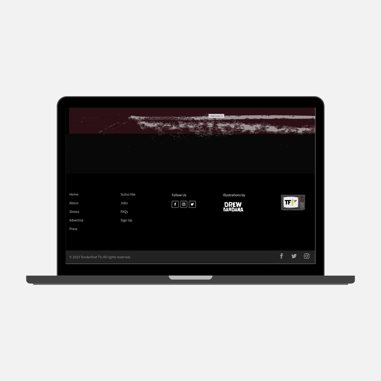
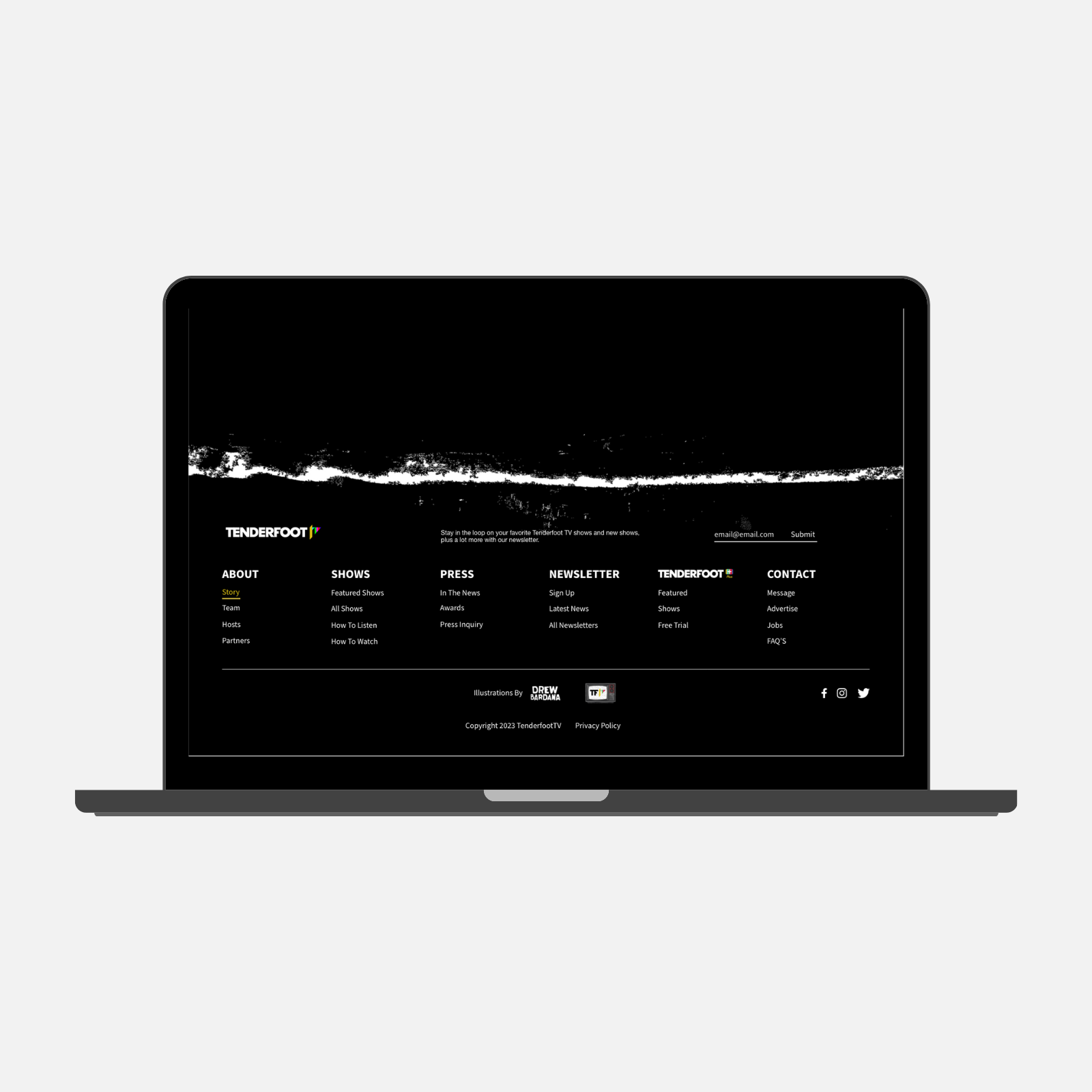
Footer Structure
The footer now groups links by purpose (About, Shows, Press, Newsletter, TV+, Contact), acting as a reliable safety net.
This improves discoverability and supports deeper engagement.
Mobile Accordion Menu
Expandable sections on mobile preserve the same categorical hierarchy as desktop without overwhelming smaller screens, ensuring a consistent mental model across devices.
Before Navigation

After Navigation

Before Footer
After Footer
- Impact -
The Results
The redesign brought structure and intentionality to a fragmented experience: improving content discovery, elevating Tenderfoot+'s visibility, and building a navigation system flexible enough to grow with the brand.
Subscription Visibility
Tenderfoot+ ranks as the second most visited page on the site following the redesign, indicating the dedicated navigation placement is successfully directing user attention to the premium offering.
Scalable Architecture
The pillar-based structure allows new shows and content categories to be added without disrupting the existing hierarchy - a key requirement as Tenderfoot's library continues to grow.
Cross-Device Consistency
Desktop and mobile now share an identical categorical structure, giving users a reliable mental model regardless of how they access the site.
Key Takeaway
Figma > Adobe XD
A miscommunication led the development team to build from an outdated file rather than the final designs. This prompted a team-wide shift from Adobe XD to Figma, ensuring that everyone, from designers to developers, is always working from a single live source of truth.
More Case Studies
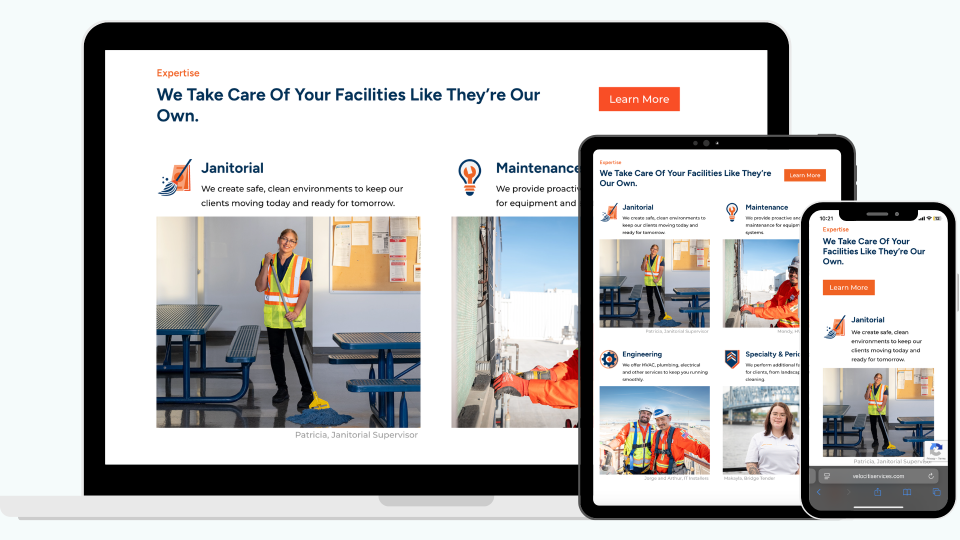
Clarifying Decision-Maker Flows
Simplified how users navigate Velociti's complex service offerings through a restructured site architecture and clearer decision-making paths.
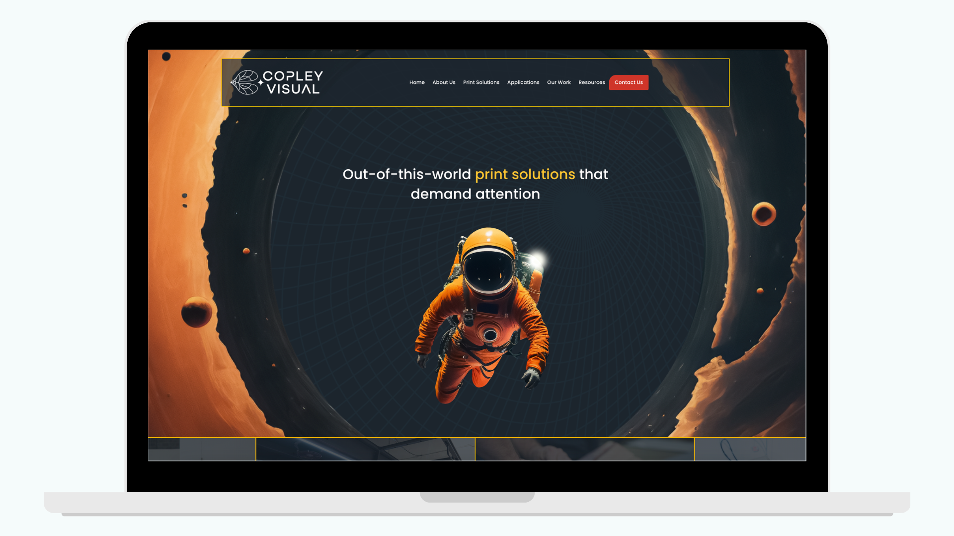
"Making Space" for a Bolder Brand
A full rebrand that finally gives Copley Visual the jaw-dropping, online presence to match their large-format work and earn trust before a client ever reaches out.