"Making Space" for a Bolder Brand

Overview
Copley Visual (formerly National Print Wholesale) does jaw-dropping, large-format printing, but their website didn't come close to telling that story. I led the UX strategy to close that gap, leaving their old name in the past and introducing the world to a bold new brand: confident, innovative, and creatively driven. The redesigned website leans into transparency and craft, positioning Copley not just as a printer, but as a visual engineer who figures it out when no one else can.
Role
UX Designer & Graphic Designer
Team
Senior Graphic Designer, Copywriter, Developer, Creative Director
Responsibilities
- Competitive analysis and synthesis of stakeholder interview insights
- Defined problem statements, information architecture, and navigation
- Wireframing, brand guidelines, and high-fidelity designs
- Managed project timelines, coordinated handoffs across creative, copy, and development
- Gathered usability feedback through internal reviews and flow walkthroughs
Problems to Solve
User Problem
A creative professional responsible for high-visibility campaigns is a decision-maker under pressure who needs a transparent, consultative print partner because uncertainty around technical feasibility and delivery reliability puts their professional credibility at risk.
Business Problem
Copley Visual is a specialized print provider with advanced capabilities who needs to clearly communicate its expertise and reliability because its current website does not differentiate it from competitors or support high-value project acquisition.
- Research & Discovery -
Gathering Insights & User Pain Points
Insights were gathered through user surveys, stakeholder interviews, and competitive audits, revealing that users valued strong relationships but lacked confidence due to unclear communication around capabilities and constraints. Users did not want vendors who said “yes” to everything; they wanted honest expectation-setting.
Decision Fatigue
The original site’s material-heavy product lists overwhelmed users and made it difficult to determine which options were appropriate for their project.
Fear of Failure
Because the site did not communicate limitations or safeguards, users worried that choosing the wrong vendor could harm their professional reputation.
Unclear Feasibility
The site failed to validate whether ambitious concepts were technically possible, forcing users to guess or seek reassurance offline.
How Might We...
-
How might we transform the website from a product catalog into a consultative decision-making tool?
-
How might we reduce user anxiety while still supporting ambitious, creative ideas?
-
How might we communicate advanced capabilities without overwhelming non-technical users?
- Ideation -
Developing Concepts
The Honest Expert
Emphasized a “Confident but Honest” voice that candidly addressed limitations, positioning Copley as a risk-reducing partner.
"Making Space"
A space-inspired narrative that framed large-format printing as immersive, boundary-pushing work.
Solutions First
A problem-based structure that organized content around outcomes rather than materials.
- Final Design -
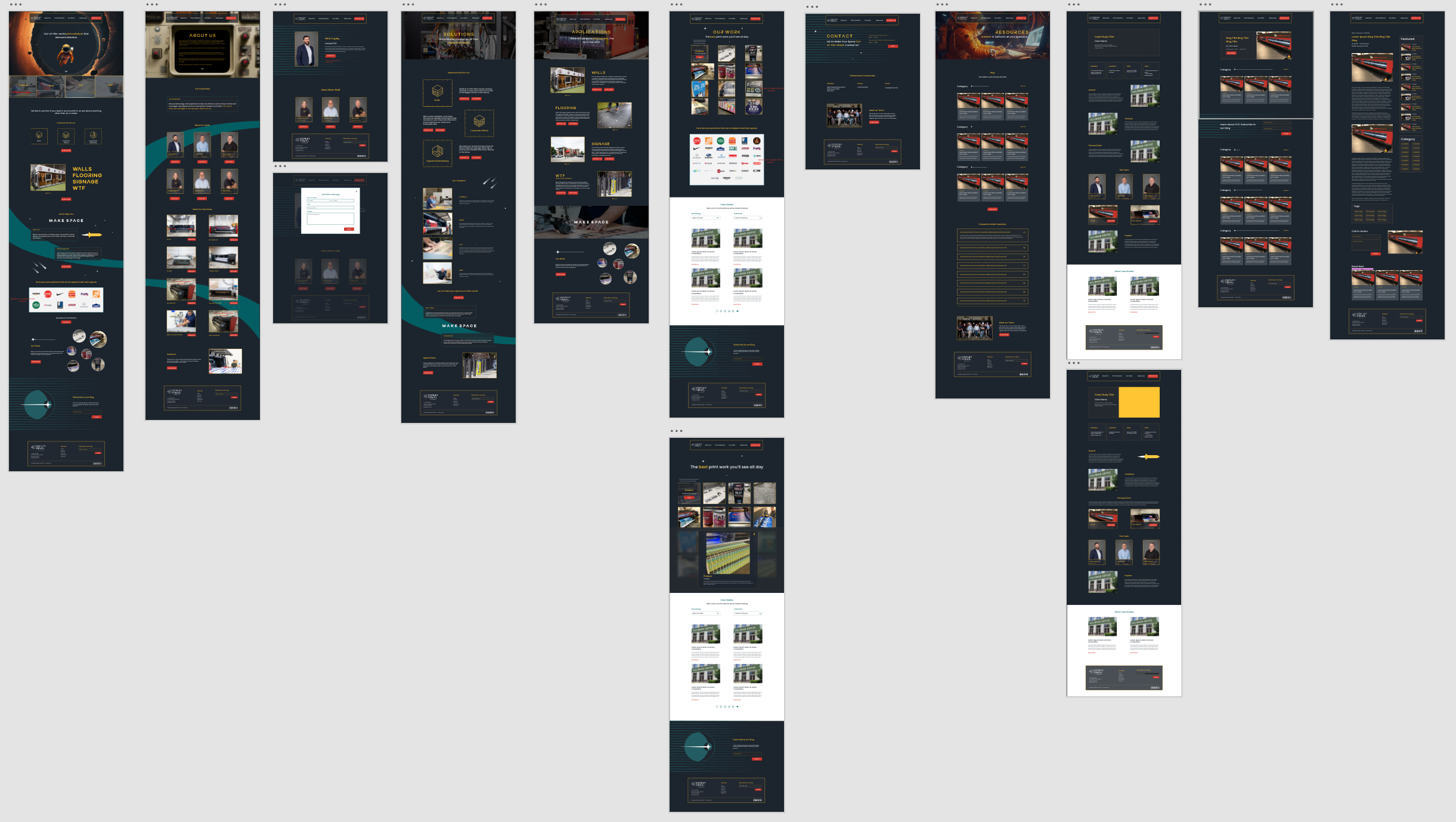
The Revised Flow
The final experience guides users from understanding what Copley does best, to how they work, to whether they’re the right fit: reducing uncertainty while reinforcing trust and expertise.
Built In Gaurd Rails
We added moments throughout the site (including the contact form) that gently redirected smaller jobs elsewhere using a tone aligned with the brand.
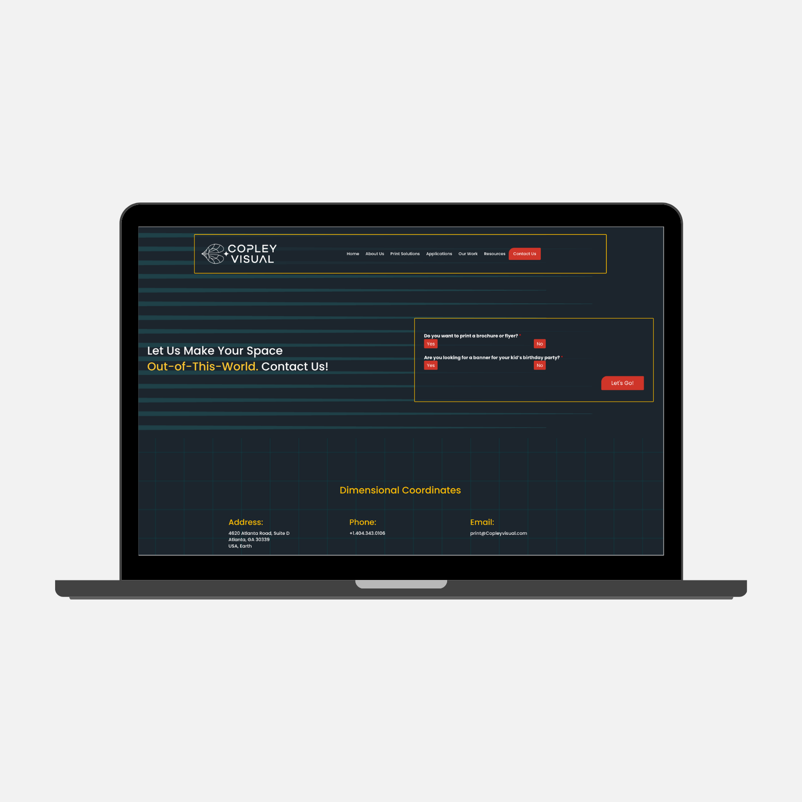
Built In Gaurd Rails
We added moments throughout the site (including the contact form) that gently redirected smaller jobs elsewhere using a tone aligned with the brand.
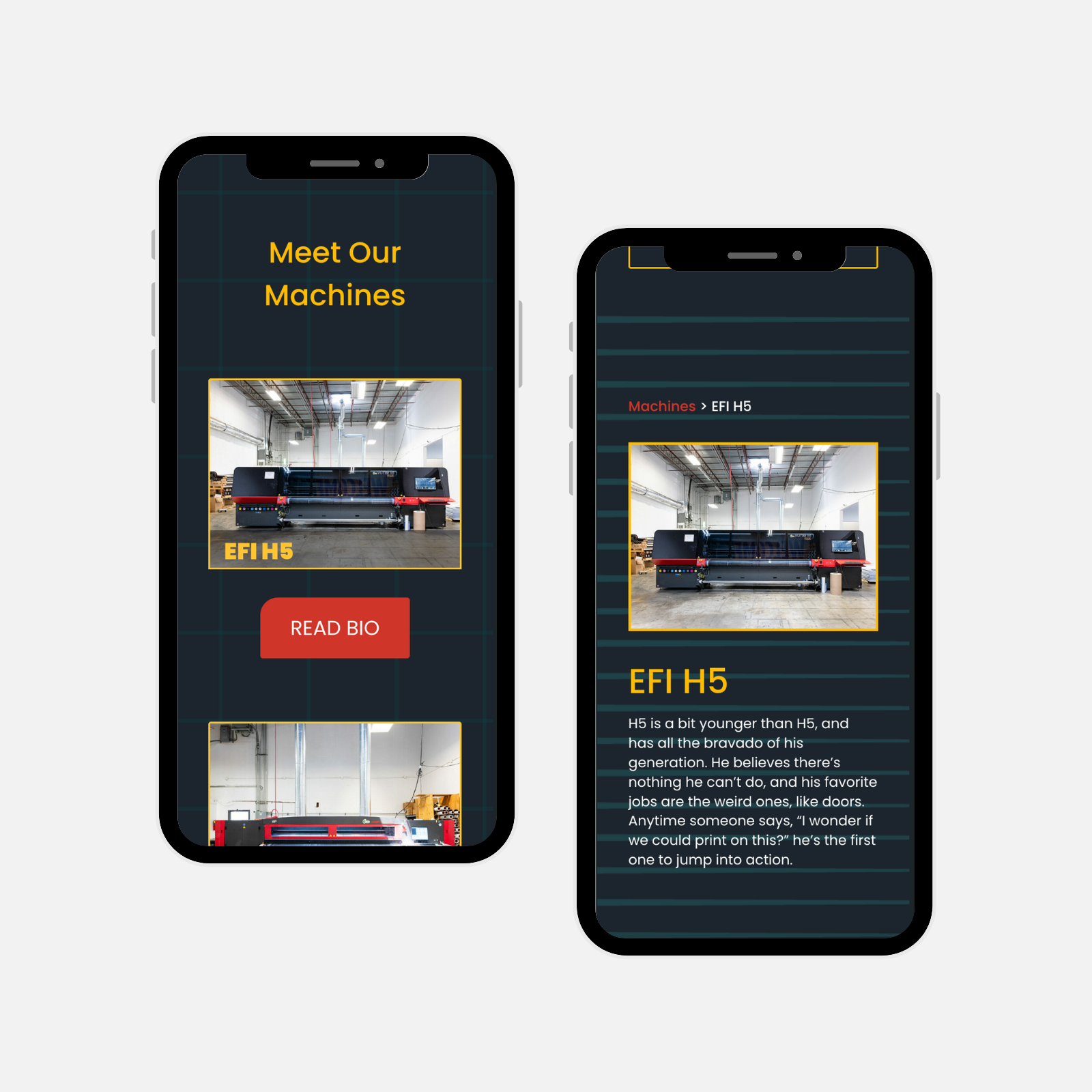
Humanizing the Machines
The About page was expanded to introduce both the team and the machinery, with equipment presented through personality-driven “bios” that explain what each machine does.
For clients unfamiliar with large-format print, this makes complex production feel more approachable while reinforcing Copley’s investment in high-end tools and expertise - building trust without overwhelming users with technical jargon.
Humanizing the Machines
The About page was expanded to introduce both the team and the machinery, with equipment presented through personality-driven “bios” that explain what each machine does and why it matters.
For clients unfamiliar with large-format print, this makes complex production feel more approachable while reinforcing Copley’s investment in high-end tools and expertise - building trust without overwhelming users with technical jargon.
Brand Reimagined
Copley’s brand evolved from a generic CMYK look to a bold, space-inspired system that reflects the scale, ambition, and precision of their work, anchored by a parallax hero that immediately differentiates them from typical print vendors.
The new brand signals “this isn’t Staples” within seconds, helping serious clients feel confident they’re working with a high-caliber partner capable of complex execution.
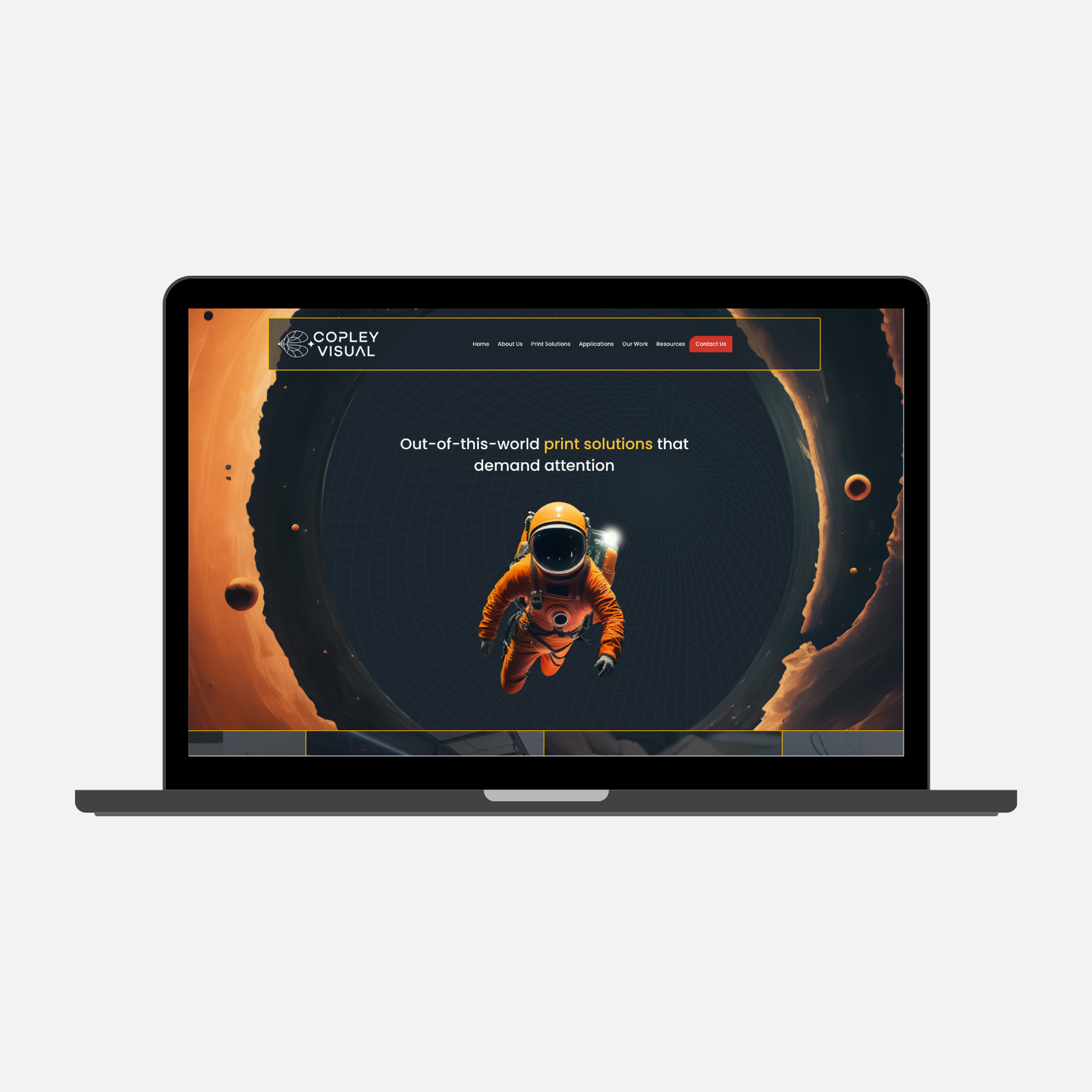
Brand Reimagined
Copley’s brand evolved from a generic CMYK look to a bold, space-inspired system that reflects the scale, ambition, and precision of their work, anchored by a parallax hero that immediately differentiates them from typical print vendors.
The new brand signals “this isn’t Staples” within seconds, helping serious clients feel confident they’re working with a high-caliber partner capable of complex execution.
- Impact -
The Results
The redesigned site repositioned Copley as a trusted partner for large-scale, complex print work - helping the right clients feel confident moving forward while discouraging misaligned inquiries.
Credibility on Arrival
The new site communicates expertise and scale before a client ever reaches out, reducing the need to establish credibility in early conversations.
Better-Fit Leads
Clear process storytelling and capability framing help prospective clients self-qualify, resulting in more aligned inquiries and smoother project conversations.
A Brand Worth Believing In
The client was proud of the result. The visual identity and site finally reflected the quality and confidence of the work they'd been doing all along.
What I Learned
AI as a Design Tool
This project was my first hands-on use of AI in my design workflow, using it to speed up exploration while relying on UX judgment to refine and align ideas with real user and business needs.
Fit Is UX
Helping users decide not to convert can be just as valuable as driving conversions.
More Case Studies
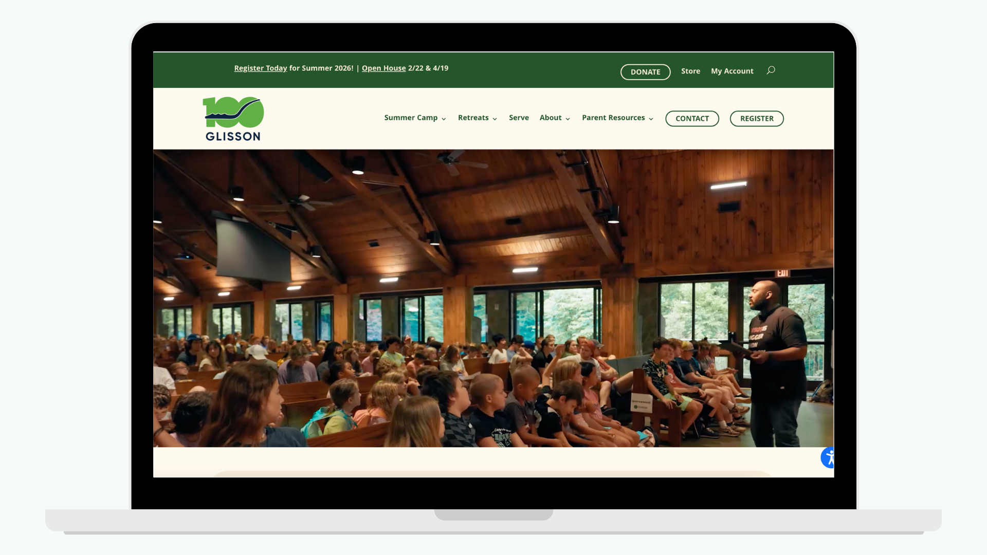
Reducing Registration Friction for Parents
Redesigned Glisson’s website to clarify programs, streamline registration, and deliver a more trustworthy, accessible experience for parents and staff.
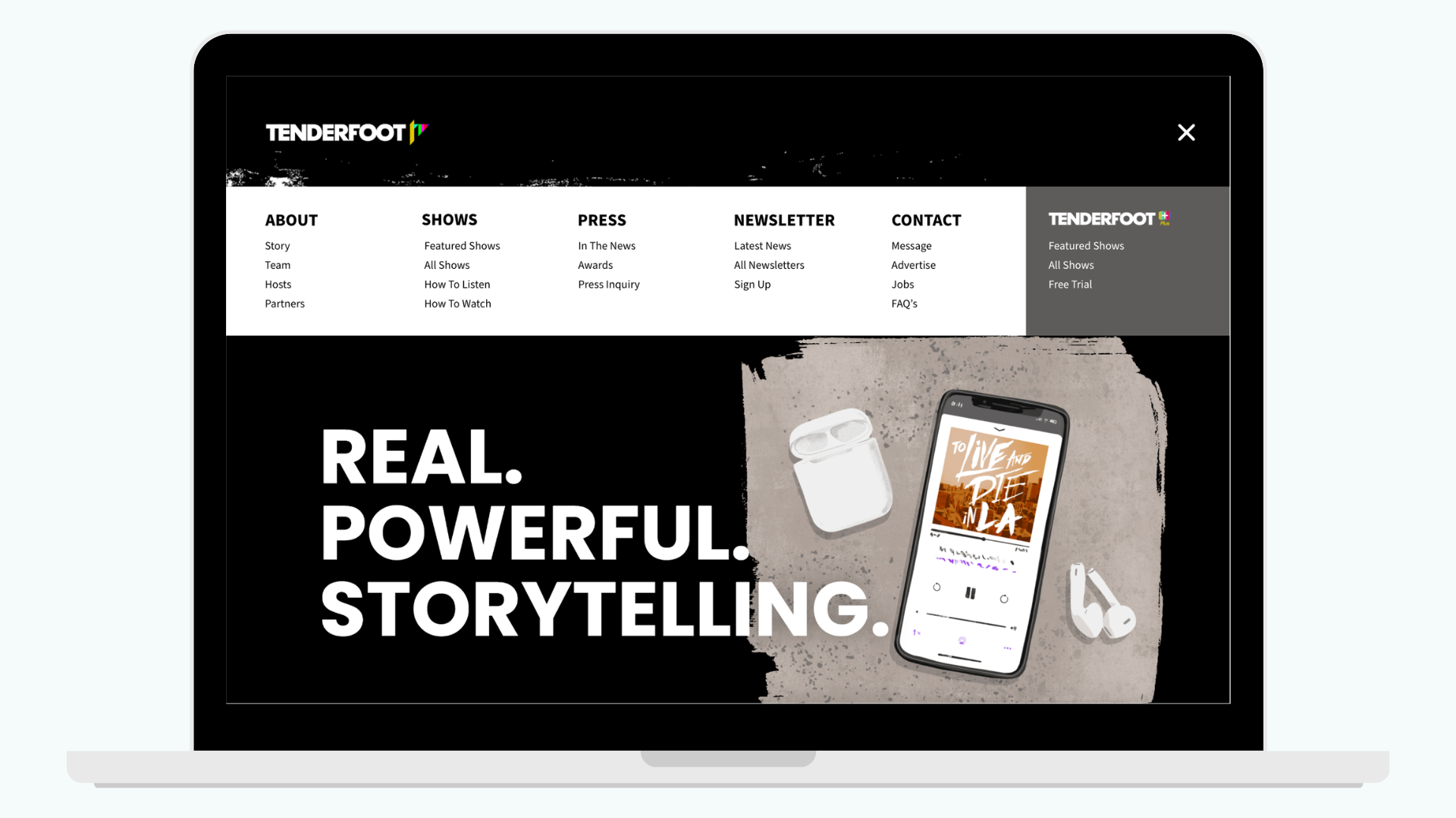
Streamlining Content Discovery
Redesigned the navigation and footer to help listeners find shows, access premium content, and discover Tenderfoot+ more easily.