
A Digital Front Porch for a Church in a Brewery

Overview
Westside Table is a modern, inclusive church community in Atlanta's Upper Westside that gathers in a local brewery. While the in-person experience felt warm and relational, the website lacked clarity, visibility, and clear next steps - especially for first-time visitors who were hesitant or skeptical to join.
After acquiring a permanent building of their own, Westside Table was ready for a new chapter: one that called for a digital presence to match. I led an end-to-end website redesign focused on clarity, sincerity, and low-pressure pathways - bridging the gap between digital discovery and in-person belonging, while reflecting the warmth and identity of their new home.
Role
UX Designer & Graphic Designer
Team
Copywriter, Developer, Creative Director
Responsibilities
- Translating business goals into user-centered solutions
- Defined problem statements, information architecture, and navigation
- Wireframing and high-fidelity designs
- Cross-functional collaboration with creative, copy, and development
- Gathered usability feedback through internal reviews and flow walkthroughs
- Project management, task and deadline tracking
User Problem
A spiritually curious first-time visitor with complicated past church experiences who needs a transparent, low-pressure way to evaluate Westside Table's culture and values before visiting in person because skepticism and negative history make emotional safety a prerequisite to any real commitment.
Business Problem
Westside Table is a modern, inclusive church community transitioning from a brewery into a dedicated building who needs a website that clearly communicates who they are and guides visitors toward a confident next step because their physical move created an opportunity to reintroduce themselves without losing the approachable culture they were known for.
- Research & Discovery -
Gathering Insights & User Pain Points
Due to budget and timeline constraints, formal user research wasn't conducted. Instead, insights were gathered through an internal staff survey to capture firsthand knowledge of visitor behavior and pain points, as well as secondary research.
Skeptical Returners
Many visitors had stepped away from church after disagreements over doctrine or politics. The longer they stayed away, the harder it felt to go back, and they weren't sure if returning, anywhere, was even an option anymore.
No Clear Picture of What to Expect
Without knowing what showing up would actually look like, hesitant visitors had no way to mentally "try before they buy", raising the stakes of an in-person visit.
Parents Were Left Guessing
The existing site offered little to no detail about children's programming, leaving parents without the reassurance they needed to feel comfortable bringing their family.
How Might We...
-
How might we make the website feel as welcoming and low-pressure as the brewery gathering itself?
-
How might we guide skeptical users forward without making them feel marketed to?
-
How might we highlight local service as a primary entry point—not an afterthought?
- Research & Discovery -
Developing Concepts
I explored visual and structural concepts ranging from traditional church layouts to highly expressive systems. The final direction balanced warmth, modernity, and sincerity - mirroring the in-person experience.
A Digital Front Porch
Clear “What to Expect” and “Plan Your Visit” sections allowing users to self-select before committing.
Neighborhood Hub
Serve opportunities and events were elevated to emphasize participation over attendance.
Modern but Rooted
A soft color palette and serif typography communicated depth and authenticity without feeling institutional.
- Final Design -
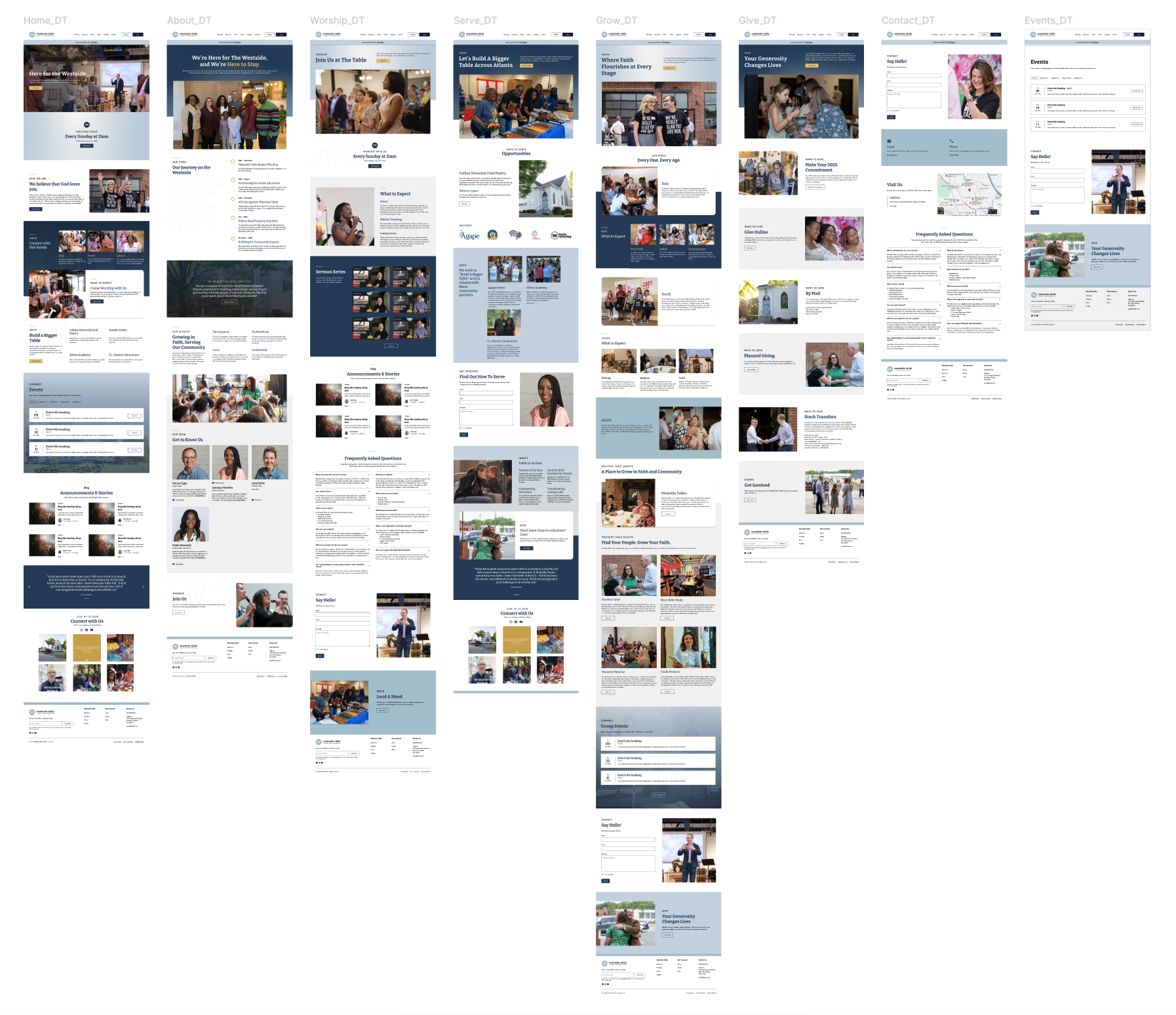
The Revised Flow
The final solution features a streamlined navigation and warm, community-driven visual identity that guides first-time visitors and families toward a confident next step: before they ever walk through the door.
An Origin Story Worth Telling
A dedicated History section gives context to a community in transition—from brewery gathering to a newly purchased, soon-to-open permanent home—building credibility through authentic growth while future-proofing the site as the church expands.
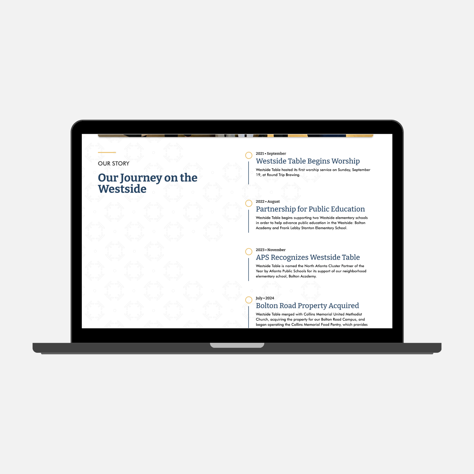
An Origin Story Worth Telling
A dedicated History section gives context to a community in transition—from brewery gathering to a newly purchased, soon-to-open permanent home—building credibility through authentic growth while future-proofing the site as the church expands.
Offered two low-pressure entry points—observe or participate—without forcing commitment.
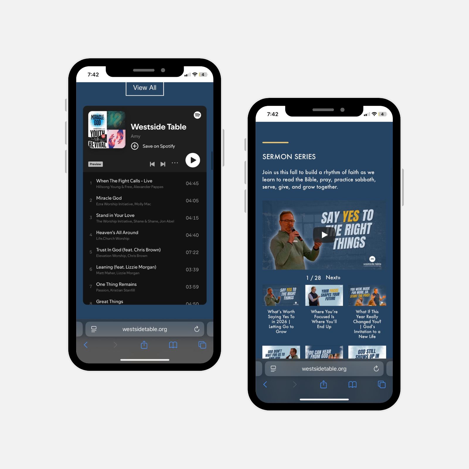
Culture You Can Feel
Integrated Spotify playlists and sermon videos let visitors experience Westside Table's personality and values before ever stepping through the door.
Culture You Can Feel
Integrated Spotify playlists and sermon videos let visitors experience Westside Table's personality and values before ever stepping through the door—answering the unspoken question every skeptical first-timer has: Do I belong here?
Built for Families
Dedicated "What to Expect" content for both kids and youth answers the specific questions parents carry into a new church experience, replacing vague reassurance with the concrete details that actually move people from hesitant to ready.
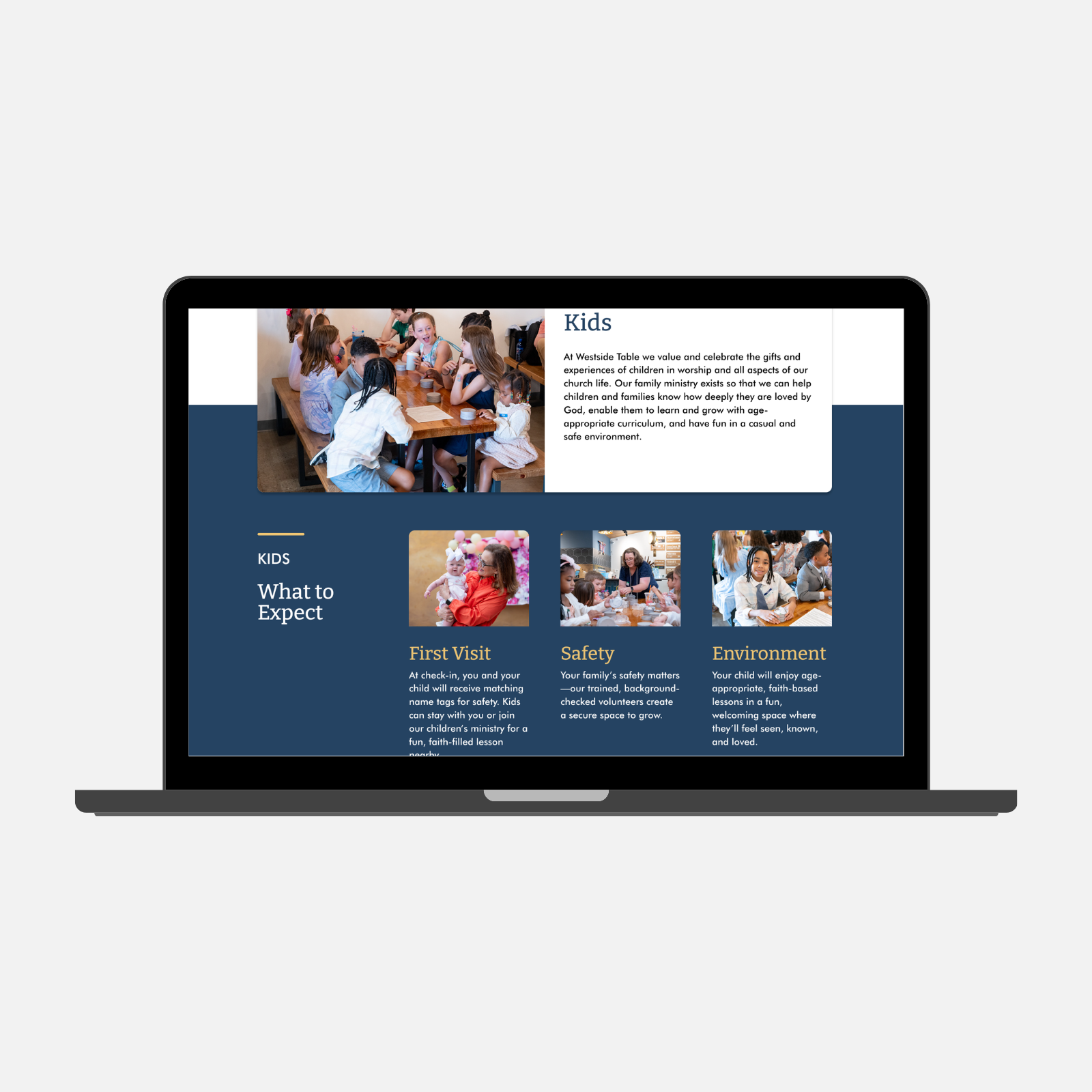
Built for Families
Dedicated "What to Expect" content for both kids and youth answers the specific questions parents carry into a new church experience, replacing vague reassurance with the concrete details that actually move people from hesitant to ready.
- Impact -
The Results
This redesign reframed the website from a content repository into a guided introduction - helping users decide if Westside Table is right for them before asking them to show up.
Visitors Arrived More Informed
Stakeholders noticed a drop in logistical questions from first-timers, suggesting the site was doing the orientation work before they walked in.
The Site Matched The Room
Internal feedback consistently noted the redesign felt more reflective of the actual Westside Table experience.
What I Learned
Good Process Starts Early
Early in the project, inconsistent communication between stakeholders and the team created gaps in clarity around goals and expectations. We responded by building a structured client intake survey and shared internal documentation - ensuring alignment on scope, timelines, and direction from the start. It was a reminder that good UX process extends beyond the product itself.
Know Your Bias
As someone without a personal connection to religion, I had to be especially intentional about checking my own assumptions at the door. I believe all designers bring their own lens to a project, but this one required an extra layer of care. Empathy helped me understand the user's hesitation. Compassion pushed me to actually do something about it (letting the community's values lead the design rather than my instincts). It was a reminder that the best design doesn't just acknowledge people's experiences; it makes room for them.
More Case Studies
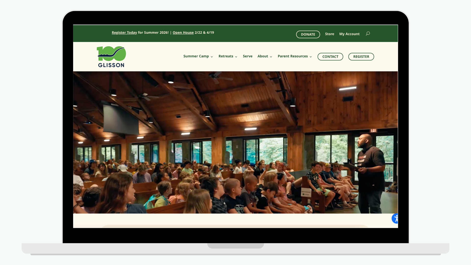
Reducing Registration Friction for Parents
Redesigned Glisson’s website to clarify programs, streamline registration, and deliver a more trustworthy, accessible experience for parents and staff.
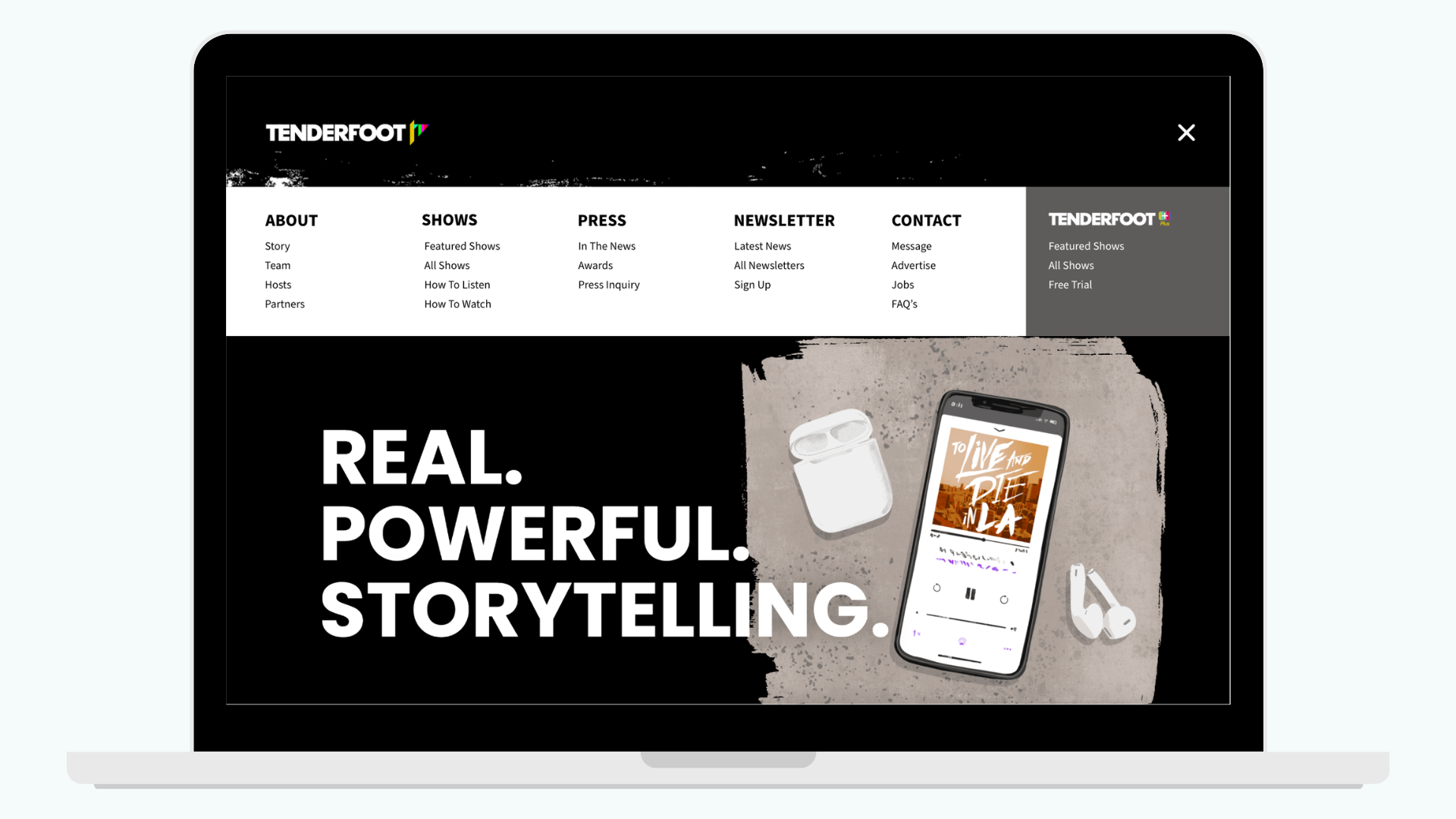
Streamlining Content Discovery
Redesigned the navigation and footer to help listeners find shows, access premium content, and discover Tenderfoot+ more easily.