A Clear Path to Girl Scouts Camp

Overview
Girl Scout Summer serves thousands of campers each year, but parents struggled to prepare for camp due to a fragmented digital experience. Critical information, such as session details, packing lists, and logistics, was scattered across emails, multiple websites, and third-party registration tools.
I led the research and design of a centralized informational website that allowed parents to clearly explore camp options and understand requirements before committing to registration. The focus was on removing unnecessary friction from the pre-camp journey so families could move forward with confidence.
Role
UX Designer & Graphic Designer
Team
Copywriter, Developer, Creative Director
Responsibilities
- Planned and led quantitative and qualitative research
- Defined problem statements, information architecture, and navigation
- Wireframing and high-fidelity designs
- Managed project timelines, coordinated handoffs across creative, copy, and development
- Gathered usability feedback through internal reviews and flow walkthroughs
User Problem
Busy parents considering Girl Scout Summer are time-pressed decision-makers who need quick access to clear, consolidated camp information because the fragmented digital ecosystem across emails, websites, and registration tools creates unnecessary stress and risks them missing critical details.
Business Problem
Girl Scout Summer is a camp program with rising costs and increasing competition for families' attention that needs a seamless, low-friction digital experience because parents who feel confused or overwhelmed during research are less likely to commit and register.
- Research and Discovery -
Adapting the Research Approach
Initial plans included gathering a large volume of parent survey responses; however, due to timing constraints, we received only five completed responses within the research window. Given a fixed launch deadline, we made the decision to move forward rather than delay the project.
Instead of treating this as a blocker, we pivoted to a blended research approach that combined:
- Qualitative insights from the five parent responses
- Historical feedback from prior Girl Scout Summer surveys and website evaluations
- Secondary research and internal stakeholder knowledge from staff who regularly supported parents through the registration process
This allowed us to ground design decisions in existing evidence while staying aligned with delivery timelines.
While the sample size was small, these findings closely mirrored feedback Girl Scout Summer had already collected, giving the team confidence that the issues identified were persistent and worth addressing.
Limited Pre-Registration Visibility
Parents had difficulty locating session details, costs, and packing lists without starting registration.
System Fragmentation Confusion
There was confusion caused by multiple platforms (the main site, CampInTouch, and Campanion).
Need for Early Expectation-Setting
Parents didn't fully understand camp expectations and requirements before committing.
How Might We...
-
How might we give parents clear visibility into sessions, costs, and logistics before they enter the registration process?
-
How might we reduce confusion caused by multiple systems by clearly defining what information lives where?
-
How might we help parents feel confident and prepared early in their decision-making journey, without requiring account creation?
- Ideation -
Developing Concepts
Intent‑Based Session Discovery
Prioritize camp "type" and format in navigation while using descriptions to bridge the gap between internal jargon and parent mental models.
Open‑Access Parent Resources
A publicly accessible resource hub containing packing lists, camp guides, and “what to expect” content—no login required.
Clear System Handoff
Explicit messaging that prepares users for the transition into the CampInTouch registration system, setting expectations around account creation and interface changes.
Key Changes
Navigation Structured by “Ways to Camp”
Research showed parents thought in terms of camp type, not internal program names.
Visible System Boundaries
Clear microcopy was added to prevent disorientation when leaving the main site.
- Final Design -
The Revised Flow
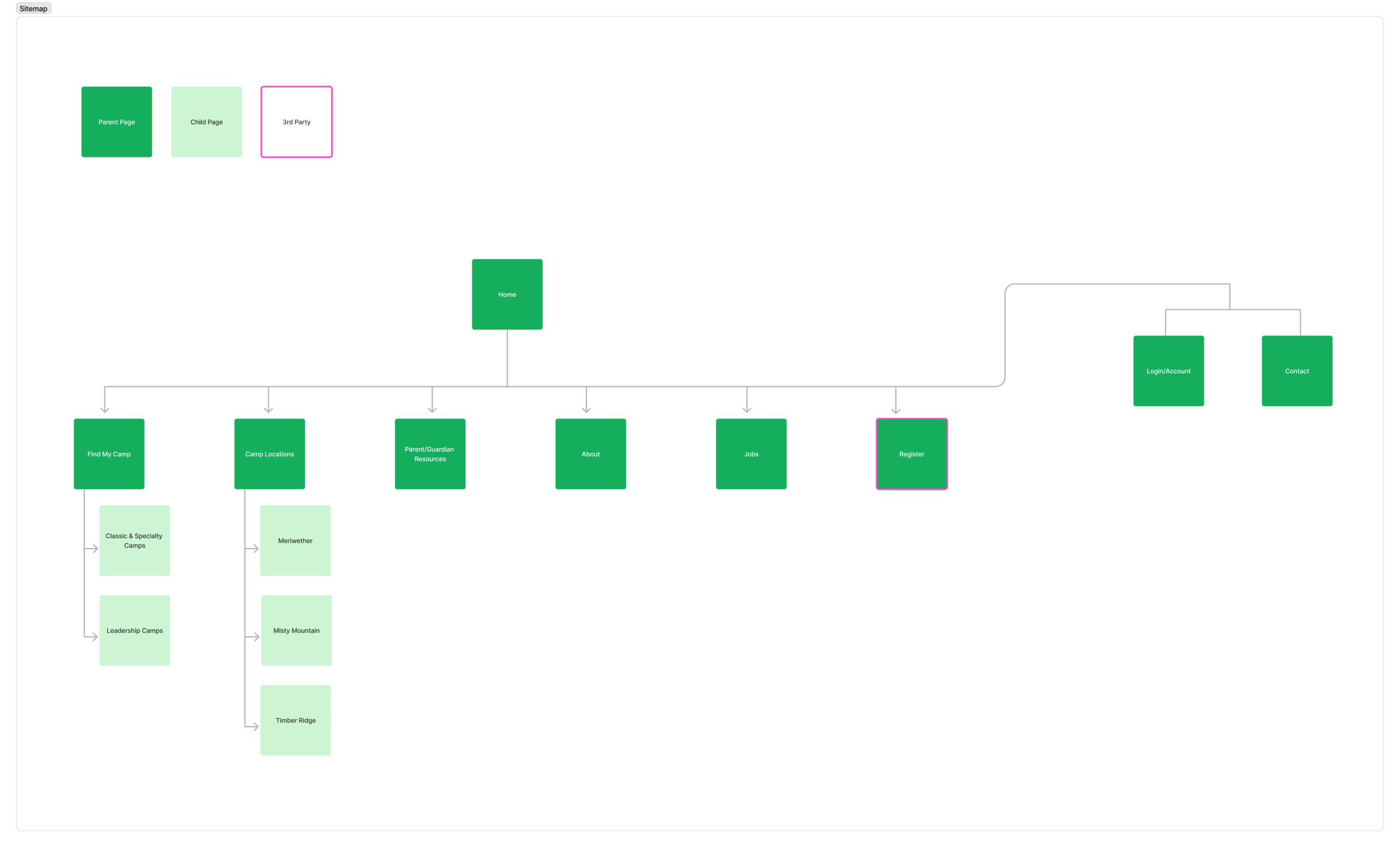
The final experience separates exploration from transaction. Parents can confidently research sessions, costs, and logistics without creating an account, then move into registration with clear expectations.
Updated Filters
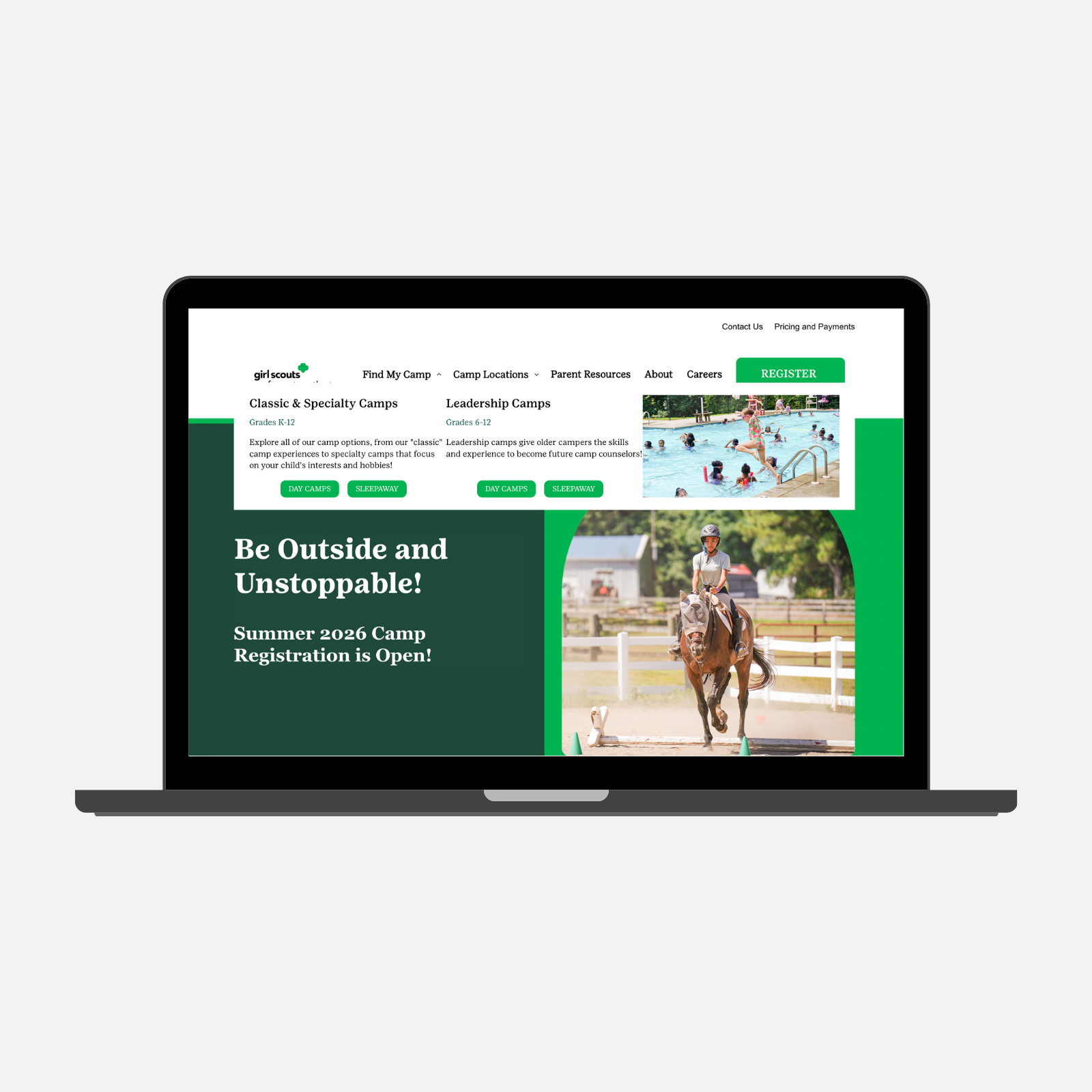
We redesigned the camp navigation to replace internal language with clear definitions for Classic, Specialty, and Leadership camps. Dropdown descriptions, separate CTA buttons for overnight and day camps, and pre-filtered Find My Camp pages now guide users to the right information immediately. Users can quickly find camps that match their needs.
Updated Filters
We redesigned the camp navigation to replace internal language with clear definitions for Classic, Specialty, and Leadership camps. Dropdown descriptions, separate CTA buttons for overnight and day camps, and pre-filtered Find My Camp pages now guide users to the right information immediately.
Users can quickly find camps that match their needs without confusion, improving their efficiency and confidence.
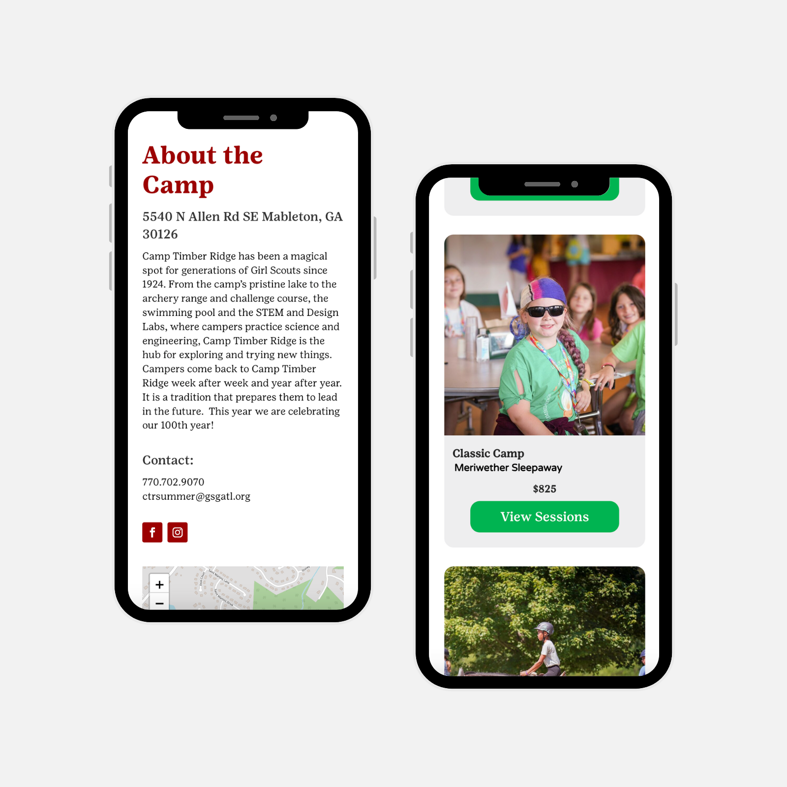
Dedicated Camp Pages
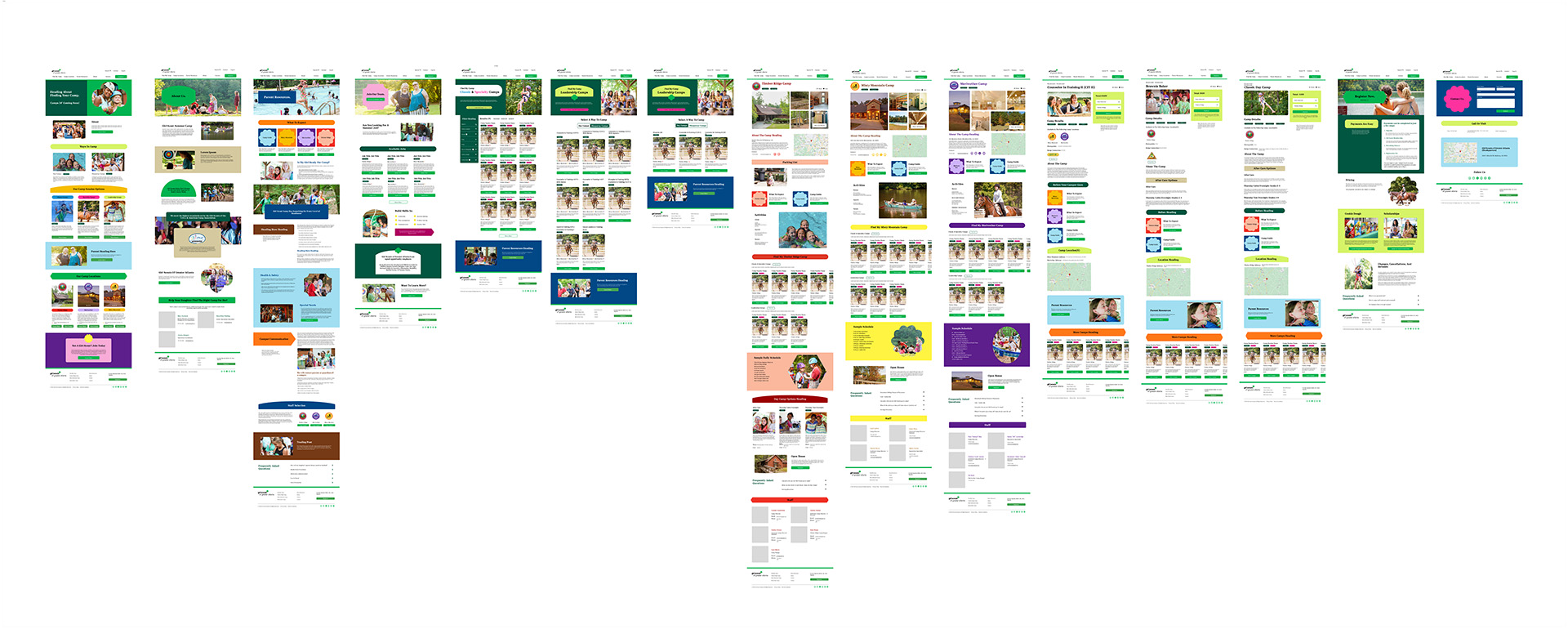
Each camp has a dedicated page that consolidates all relevant details, ensuring parents can access comprehensive information without guessing or navigating multiple screens.
Dedicated Camp Pages
Each camp type has a dedicated page (now two after program consolidation) that consolidates all relevant details, ensuring parents can access comprehensive information without guessing or navigating multiple screens.
Parents can make informed decisions with all critical information in one place, reducing the need to contact support or explore multiple pages.
- Impact -
The Results
Simplified Information Access
Designed to allow parents to research sessions, costs, and preparation requirements without entering the registration system, supporting a smoother path from exploration to commitment.
Clear System Transitions
Rather than masking the handoff to the external registration platform, clear messaging was added to prepare parents for the transition, reducing inquiries about the surprise of moving between systems.
What I Learned
Prioritize Impact
With limited user responses and a tight deadline, focusing on the highest-impact problems ensured meaningful improvements without overcomplicating solutions.
Leverage Existing Insights
This project reinforced that incomplete data, when combined with other sources, can still ground confident design decisions, and that waiting for perfect research conditions often costs more than it gains.
Design for Reality, Not the Ideal
Designing across third-party systems reinforced that clearly signaling transitions, rather than masking them, is a more honest and sustainable approach when a seamless experience isn't technically possible.
More Case Studies
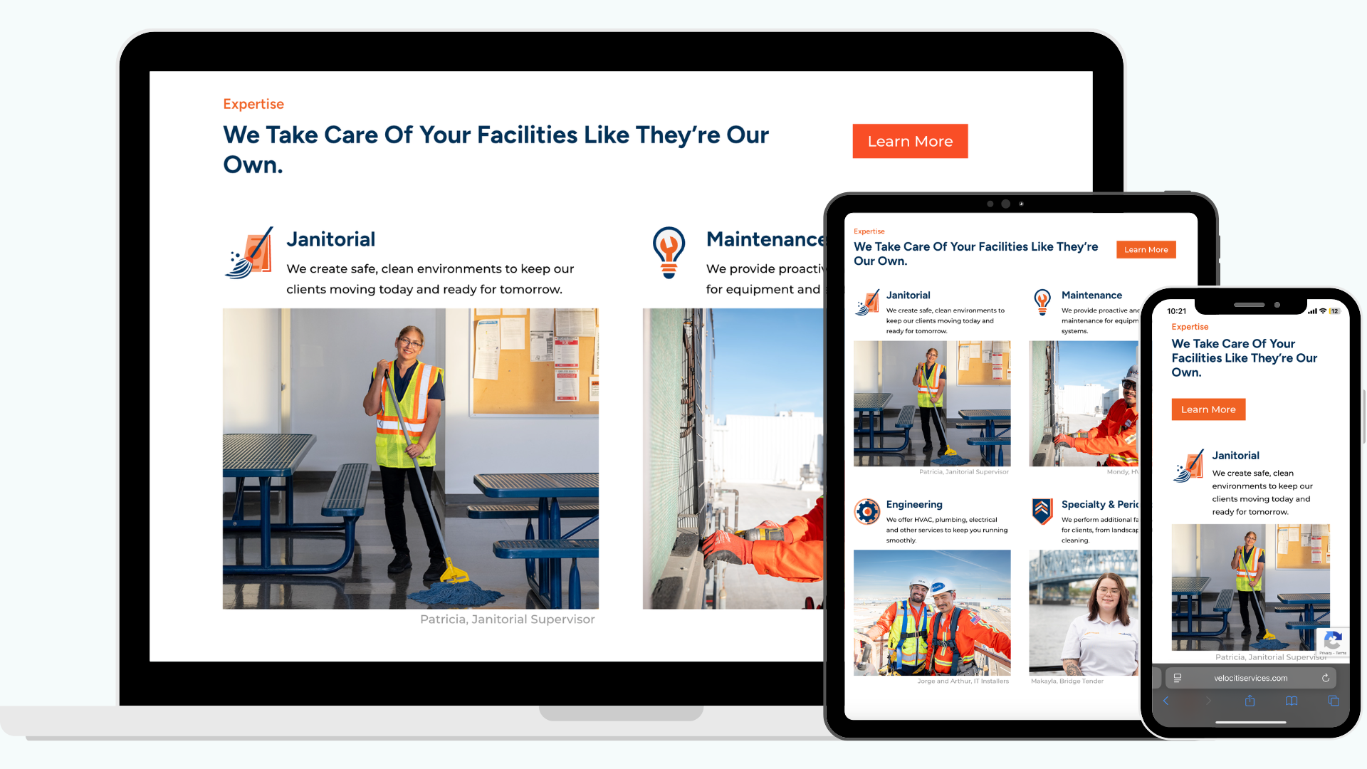
Clarifying Decision-Maker Flows
Simplified how users navigate Velociti's complex service offerings through a restructured site architecture and clearer decision-making paths.
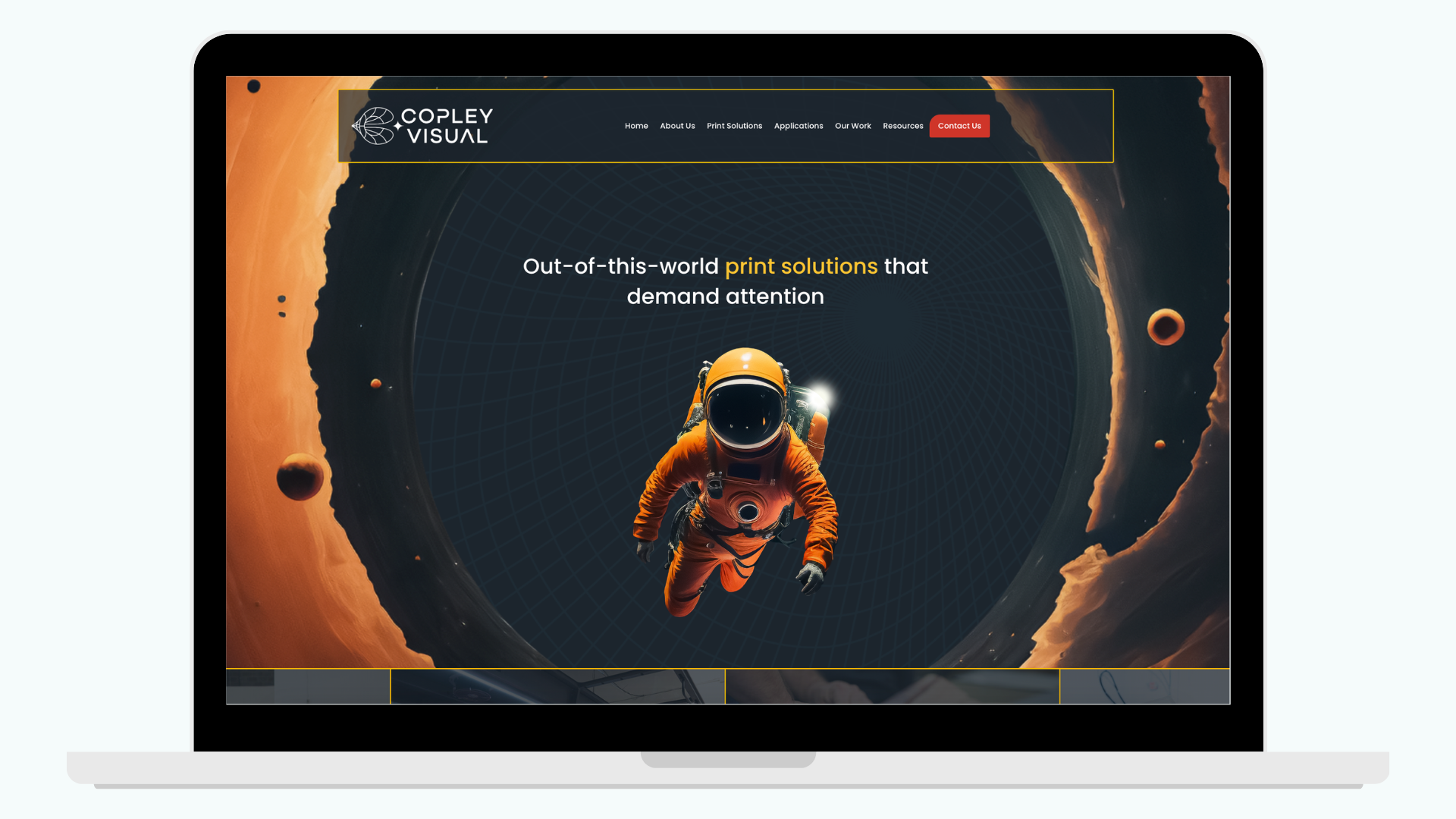
"Making Space" for a Bolder Brand
A full rebrand that finally gives Copley Visual the jaw-dropping, online presence to match their large-format work and earn trust before a client ever reaches out.