
Clarifying Decision-Maker Flows

Overview
Velociti is a national facility services provider competing in a market where most vendors look and sound identical. They needed more than a visual refresh, they needed a site that could speak clearly to high-stakes B2B buyers and actually support the sales process.
As the sole UX designer, I led the full redesign from discovery through developer handoff, turning stakeholder and business insights into a streamlined site structure, intuitive navigation, and layouts designed around how decision-makers evaluate and shortlist vendors. I collaborated closely with a creative director, copywriter, and developer throughout, balancing user needs, business goals, and real production constraints.
Role
UX Designer & Graphic Designer
Team
Copywriter, Developer, Creative Director
Responsibilities
- Competitive analysis and stakeholder interview synthesis to identify positioning opportunities
- Defined problem statements, information architecture, and navigation hierarchy
- Wireframes through high-fidelity design, including contribution to brand guidelines
- Facilitated flow walkthroughs and internal reviews to test decisions before development
- Cross-functional collaboration with creative, copy, and development from discovery to handoff
- Project management, task and deadline tracking
User Problem
A Facility Director is a high-stakes B2B decision-maker who needs to quickly determine whether a facility services provider is trustworthy and dependable because most providers present identical capabilities and generic value propositions, making it difficult to assess who will actually show up and perform consistently.
Business Problem
Velociti is a national facility services provider operating in a highly commoditized market that needs to differentiate beyond standard service offerings because competing on identical capabilities and messaging makes it difficult to earn trust and build long-term, relationship-driven contracts.
- Research & Discovery -
Gathering Insights & User Pain Points
Stakeholder interviews, field team surveys, and a competitive audit revealed that competitors were all saying the same thing and saying too much of it. Dozens of similar services listed without meaningful structure left decision-makers with no clear reason to choose one vendor over another.
Broken & Unclear Experience
The site’s technical issues, outdated visuals, and stock imagery created friction and reduced confidence.
Navigation & Content Overload
Long service lists made it hard for users to quickly find relevant information.
Limited Proof of Scale and Reliability
The site didn’t surface enough credibility indicators early in the experience.
How Might We...
- Reposition Velociti from a generic provider to a relationship-focused partner that builds immediate trust?
- Simplify service offerings into an intuitive structure for time-constrained decision-makers?
- Use authentic storytelling to demonstrate dependability in a credibility-driven market?
- Ideation -
Developing Concepts
Concepts were explored through collaborative virtual work sessions that translated Velociti’s brand into navigational and content strategies. Ideas were evaluated based on clarity, trust signals, and reduction of user friction.
“Spaces” IA Framework
Grouping industries into three intuitive property types: Large Facilities, Campuses, and Distributed Facilities to help users quickly identify relevant solutions.
Associate-First Narrative
Reordering the team section to spotlight hourly associates and real teams before executive leadership, reinforcing a people-led value proposition.
Expertise Consolidation
Replacing exhaustive service lists with four core expertise pillars, supported by a flexible “Specialty” category to maintain clarity without oversimplification.
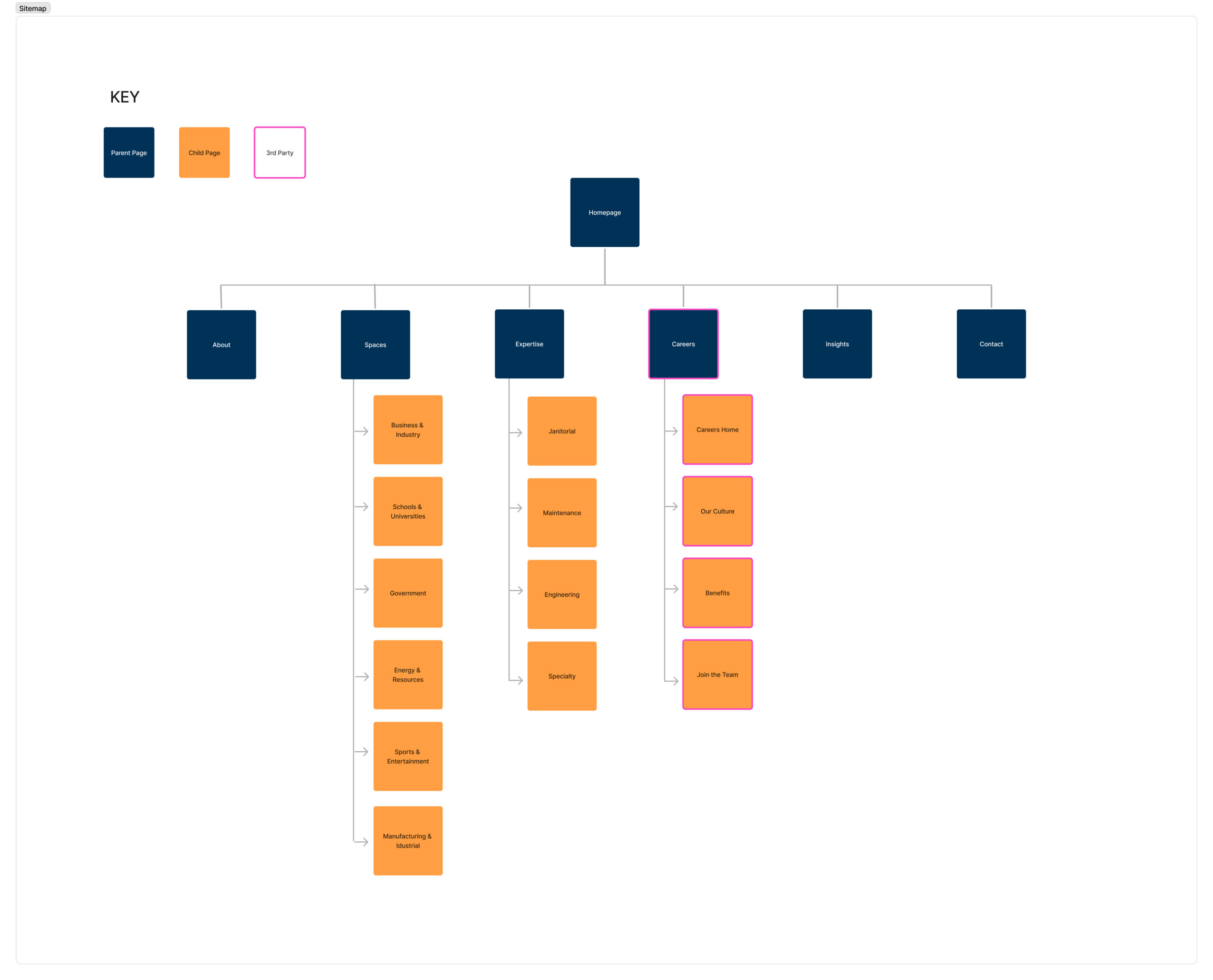
Key Sitemap Changes
From Internal Lists to User Logic
Reframed site structure around user mental models instead of internal service lists to reduce friction and confusion.
Navigation That Adapts
Introduced a layered navigation system that prioritizes clarity while keeping the experience open to non-standard or emerging use cases.
Guiding Confidence
Treated information architecture as a trust signal, helping high-stakes users validate fit and credibility early in the journey.
- Final Design -
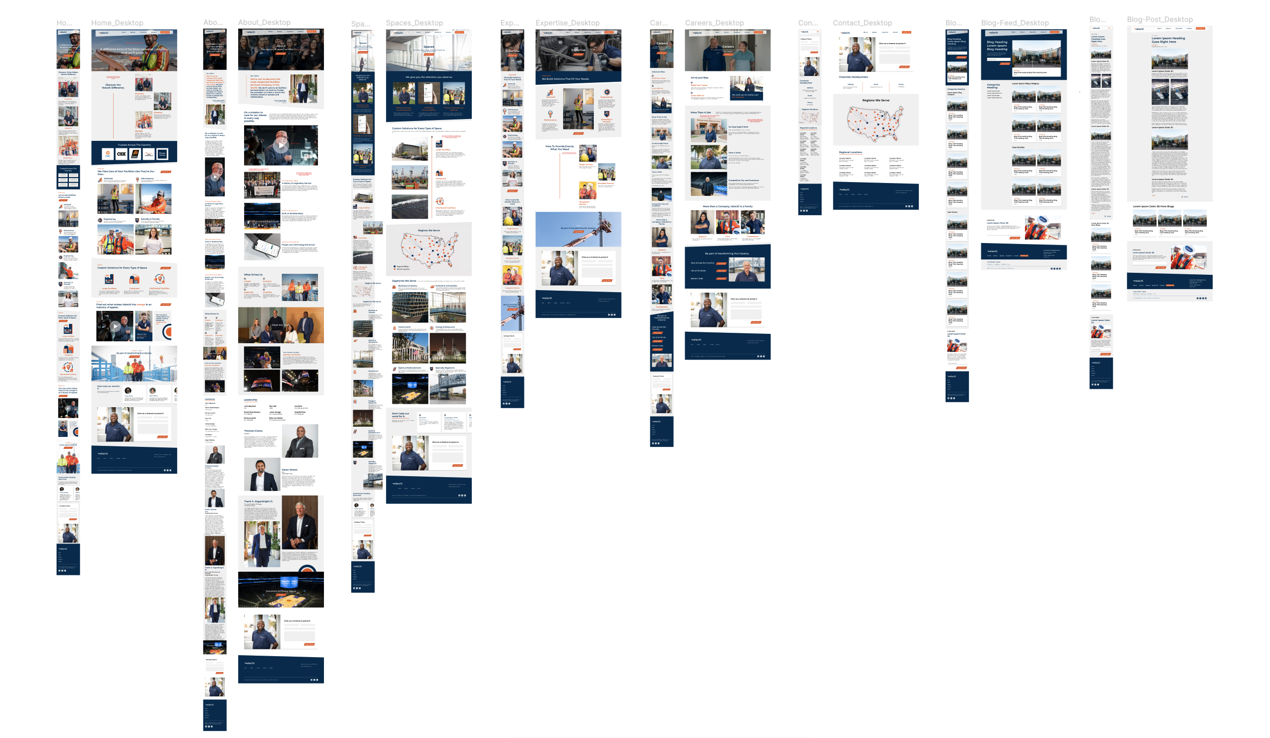
The Revised Flow
The final solution transformed the site into a clear, relationship-driven experience that validates trust through simplified navigation, authentic visuals, and focused storytelling.
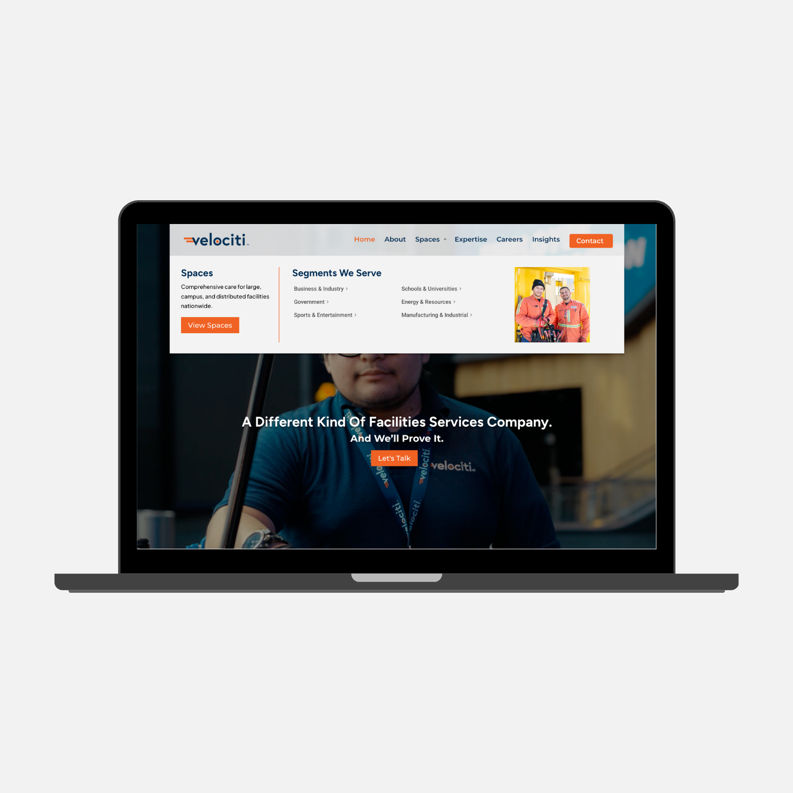
Navigation Restructuring
We replaced long service lists with a streamlined menu organized by Expertise and Spaces, introducing a Specialty category to keep the system open to emerging or niche industries.
Navigation Restructuring
We replaced long service lists with a streamlined menu organized by Expertise and Spaces, introducing a Specialty category to keep the system open to emerging or niche industries.
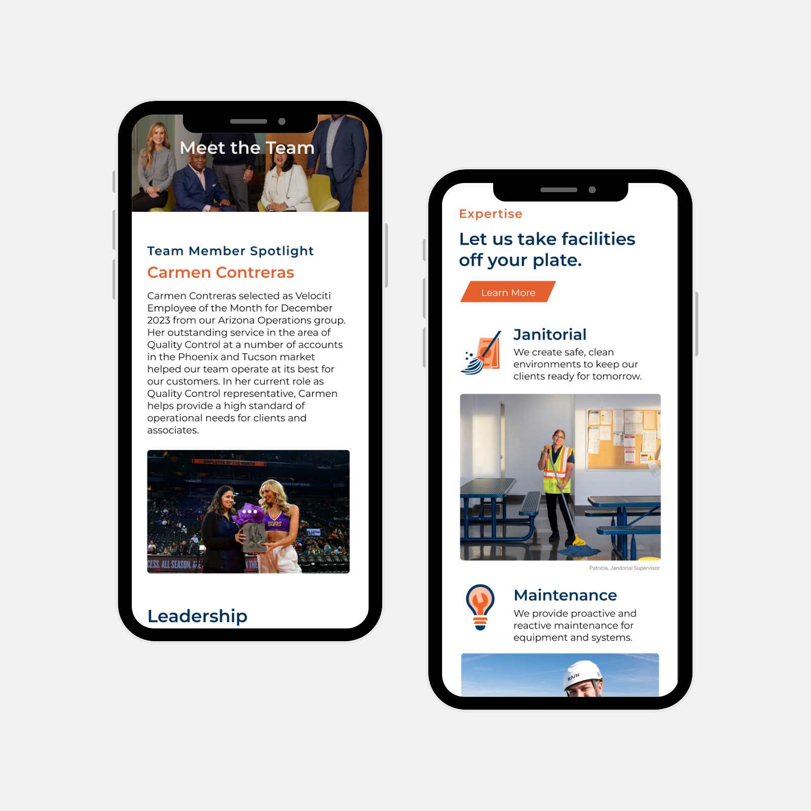
Humanizing the Brand
We moved beyond a traditional “About” page by spotlighting employees before leadership and labeling real team members by name and role throughout the site.
Humanizing the Brand
We moved beyond a traditional “About” page by spotlighting employees before leadership and labeling real team members by name and role throughout the site.
This is important because it builds trust and dependability by showing that Velociti is powered by real people, not abstract brand claims.
National Coverage Map
We added an interactive map that shows Velociti’s regional offices and service coverage across the U.S.
This gives decision-makers immediate clarity and confidence in the company’s national reach and local presence.
* This is currently being expanded to a more robust system
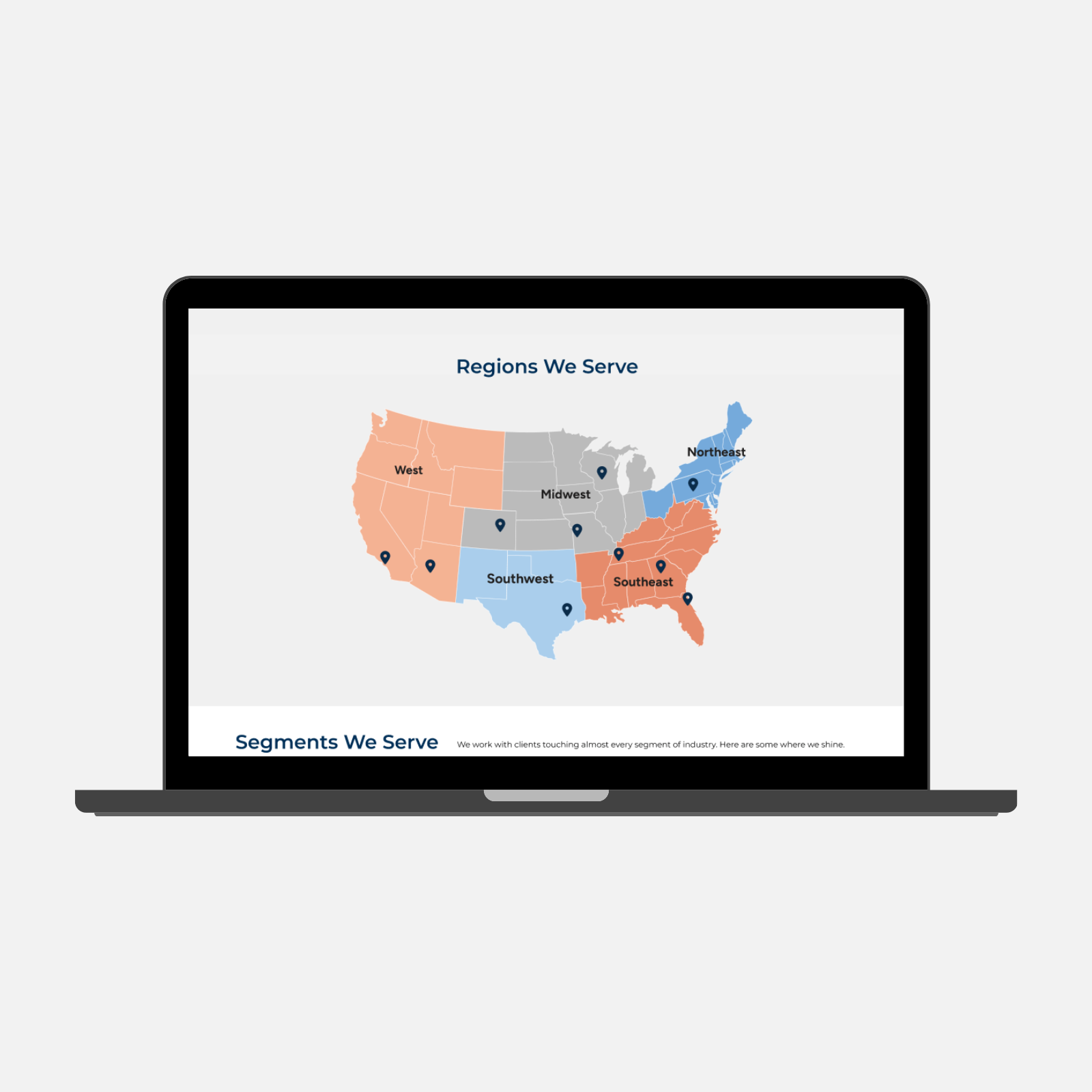
National Coverage Map
We added an interactive map that shows Velociti’s regional offices and service coverage across the U.S.
This gives decision-makers immediate clarity and confidence in the company’s national reach and local presence.
* This is currently being expanded to a more robust system
- Impact -
The Results
The redesign successfully differentiated Velociti from commoditized competitors by clarifying services and reinforcing a people-first brand narrative. The site now functions as a primary sales enablement and credibility tool.
Reduced Cognitive Load
The redesign reduced the site's primary navigation from 12+ subpages to 4 core service categories, restructuring content to surface key offerings within a single click from the homepage.
Visual Trust
Achieved visual authenticity through exclusive use of real employee photography.
What I Learned
Human-Centered Perspective
I realized the importance of considering the human impact behind every design choice. Even in a B2B context, showing real people and thinking about how users perceive credibility can shape trust in subtle but meaningful ways.
Strategic Prioritization
Working without formal user testing reinforced how critical it is to prioritize what matters most to users. I learned to balance assumptions, research, and design principles to make decisions that maximize clarity and impact.
Structured PM
The creation of standardized templates for updates, tasks, and deadlines kept everyone aligned, while a centralized deliverables document gave the client one easy place to track progress.
- Brand & Marketing Expansion -
Extended Design System
In addition to the website, I extended the brand system across a wide range of sales, marketing, and internal materials. This included a modular proposal system, presentation templates, and recruitment and employee-facing collateral.
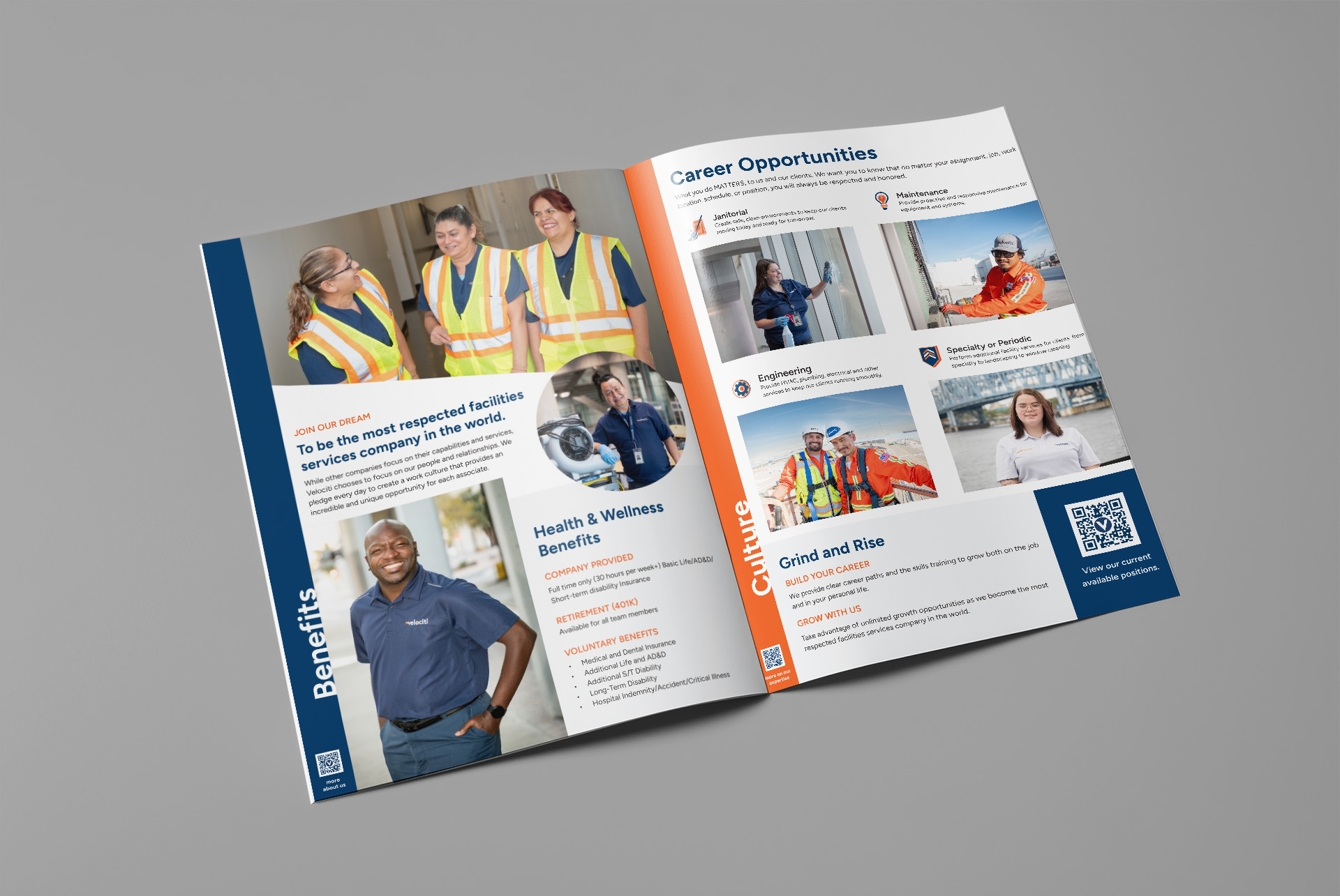
Deliverables
-
Rack cards & flyers
-
Business cards
-
Employee handbook
-
Recruitment brochure
-
~50 page proposal system
-
~50 slide presentation system with reusable templates
More Case Studies
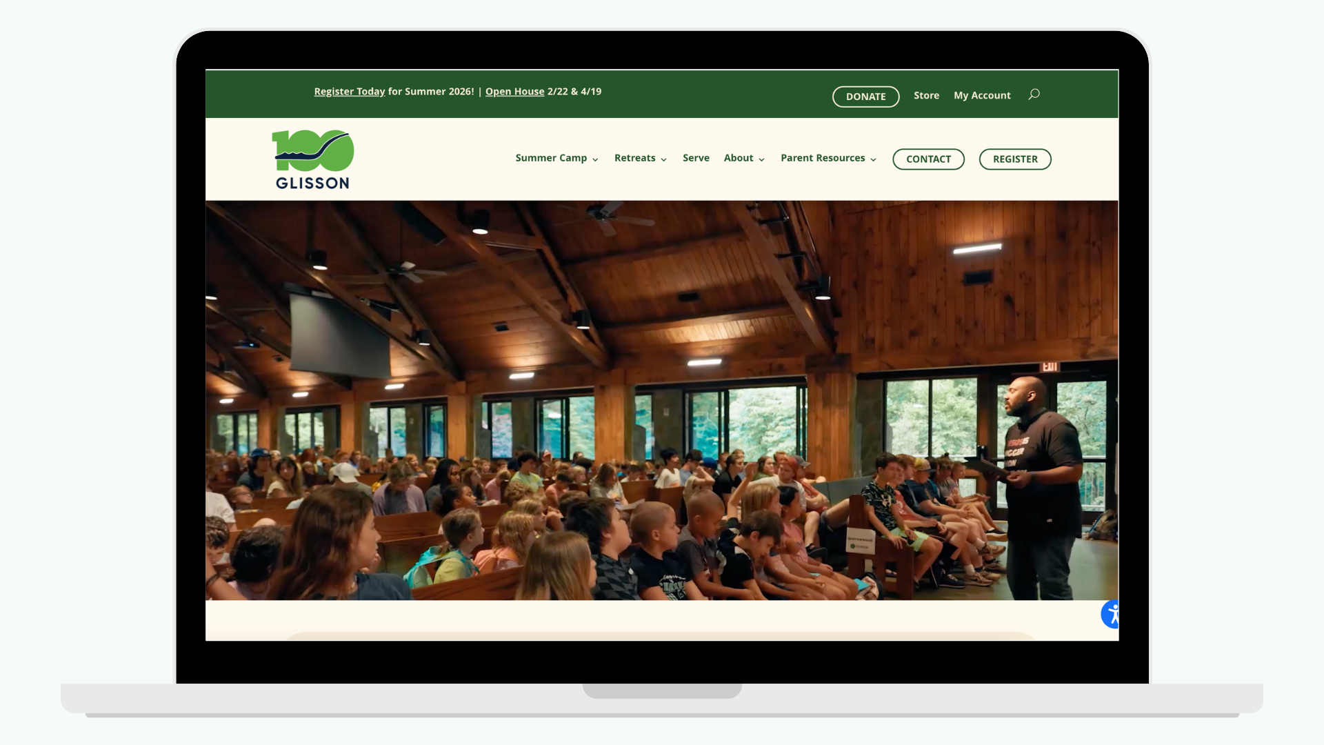
Reducing Registration Friction for Parents
Redesigned Glisson’s website to clarify programs, streamline registration, and deliver a more trustworthy, accessible experience for parents and staff.
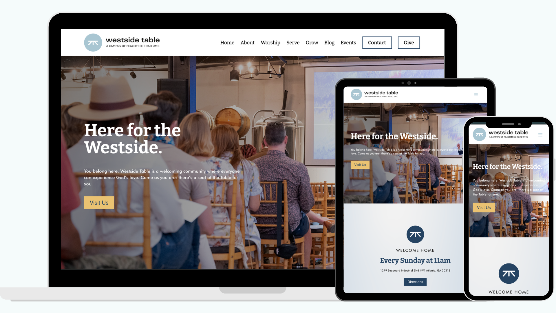
A Digital Front Porch for a Church in a Brewery
Reimagined the path from online curiosity to in-person belonging, aligning the digital experience with the warmth of the church's new home.