
Reducing Registration Friction for Parents

Overview
Ahead of its 100th anniversary, Glisson Camp & Retreat Center needed a website that would increase summer camp enrollment and improve parent confidence. The existing experience created friction around program clarity, logistics, and registration due to outdated navigation, static content, and a required third-party registration system. As the UX Designer, I led research, information architecture, and design to create a clearer, more trustworthy, and accessible experience that reduced staff burden and improved mobile engagement.
Role
UX Designer & Graphic Designer
Team
Copywriter, Developer, Creative Director
Responsibilities
- Translating business goals into user-centered solutions
- Defined problem statements, information architecture, and navigation
- Wireframing and high-fidelity designs
- Managed project timelines, coordinated handoffs across creative, copy, and development
- Gathered usability feedback through internal reviews and flow walkthroughs
Problems to Solve
User Problem
Busy parents are overwhelmed decision-makers who need to quickly understand program options and find essential logistics because confusion between the website and registration system creates uncertainty at a high-stakes moment, causing them to abandon or delay enrollment.
Business Problem
Glisson is a camp and retreat organization that needs a clearer path from information to enrollment because an outdated site structure and a required third-party registration system were creating friction for families and increasing operational strain on staff.
- Research & Discovery -
Gathering Insights & User Pain Points
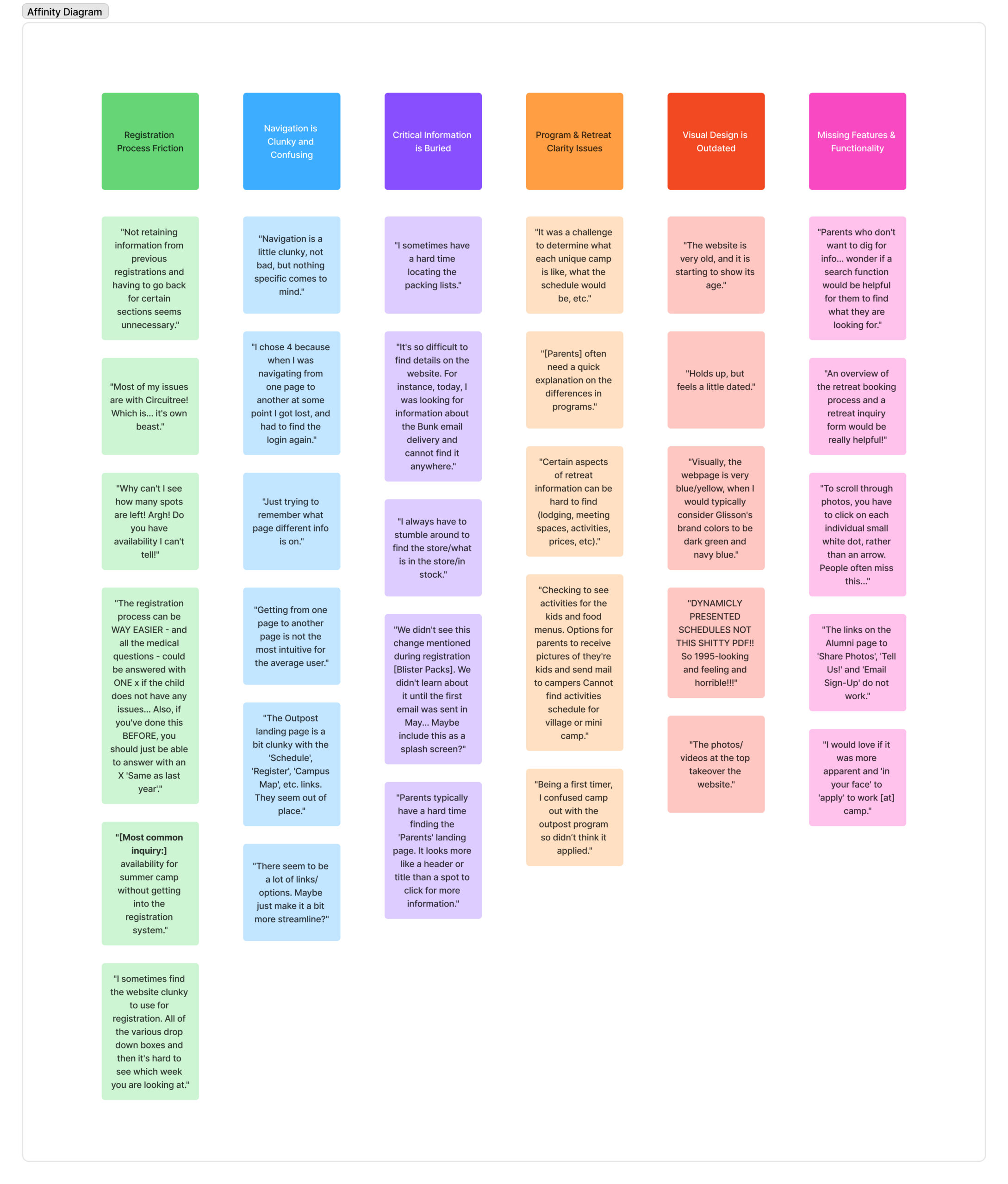
Insights were gathered through stakeholder interviews, parent and staff surveys, analytics, heatmaps, and session recordings. Research revealed navigation confusion, registration friction caused by static calendars and Circuitree (3rd party system) handoffs, poor mobile performance, and accessibility gaps.
Registration Friction
Users struggle with the current registration process, including repeated inputs, unclear availability, and overly complex forms, creating friction and frustration.
Confusing Navigation
Information is buried, links are inconsistent, and pathways are unclear, leaving users unsure where to find what they need.
Program Clarity Gaps
Camp and retreat details are hard to locate, and schedules and program differences aren’t immediately apparent.
How Might We...
- How might we help parents quickly understand program differences and requirements?
- How might we reduce friction caused by the required third-party registration system?
- How might we build trust through clarity, accessibility, and mobile-first design?
- Ideation -
Developing Concepts
Streamlined Registration Flow
We considered ways to reduce registration friction by linking users directly to the appropriate Circuitree registration page for their selected program, exploring how this could simplify the enrollment process and reduce confusion for parents.
Task-Based Navigation & Search
We conceptualized a "utility-first" mega-menu and prominent search capability to accommodate users who bypass standard navigation flows to "hunt" for specific logistical items, such as "packing lists" or "lodging," immediately.
Program Comparison Hub
We considered designing a centralized "Camps and Programs" overview page designed to function as a decision-making filter, clearly differentiating the Village, Outpost, and Sparrowwood programs to resolve persistent user confusion regarding their differences.
Key Changes
From Internal Lists to User Logic
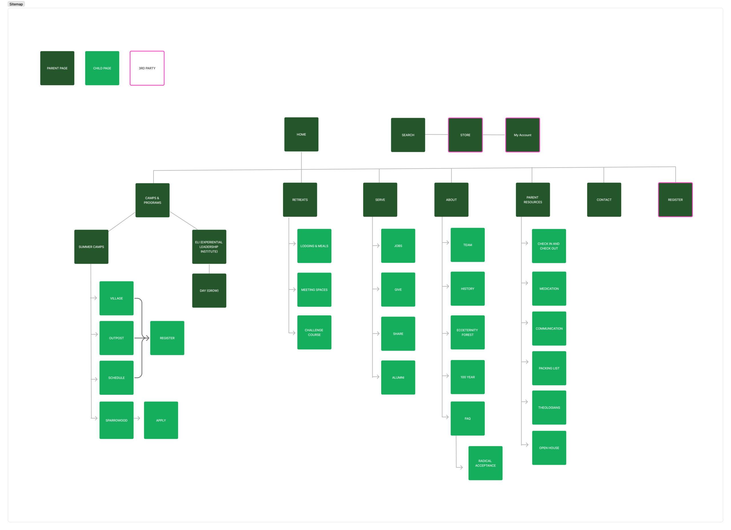
We chose to build a mega menu structure to remedy the "clunky" navigation issues and allow users to see the breadth of programs (Summer, Retreats, Day Camps) at a glance.
- Final Design -
The Revised Flow
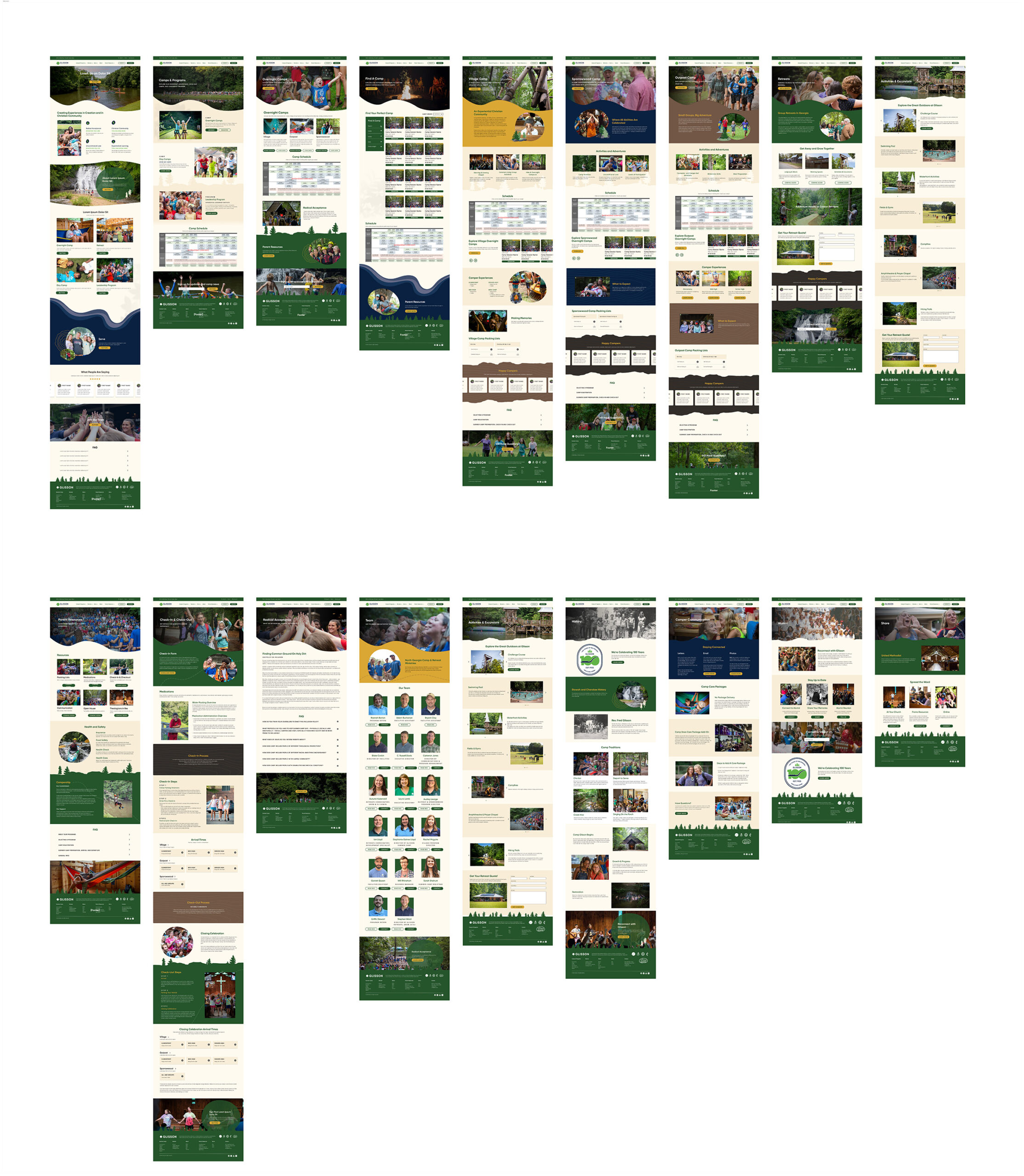
The final solution features a streamlined mega-menu and search-enabled navigation that guides distinct personas (parents, retreat leaders) directly to their goals, supported by a "nature-first" visual identity that builds trust through authentic video and imagery.
Program Sub-Landing Pages
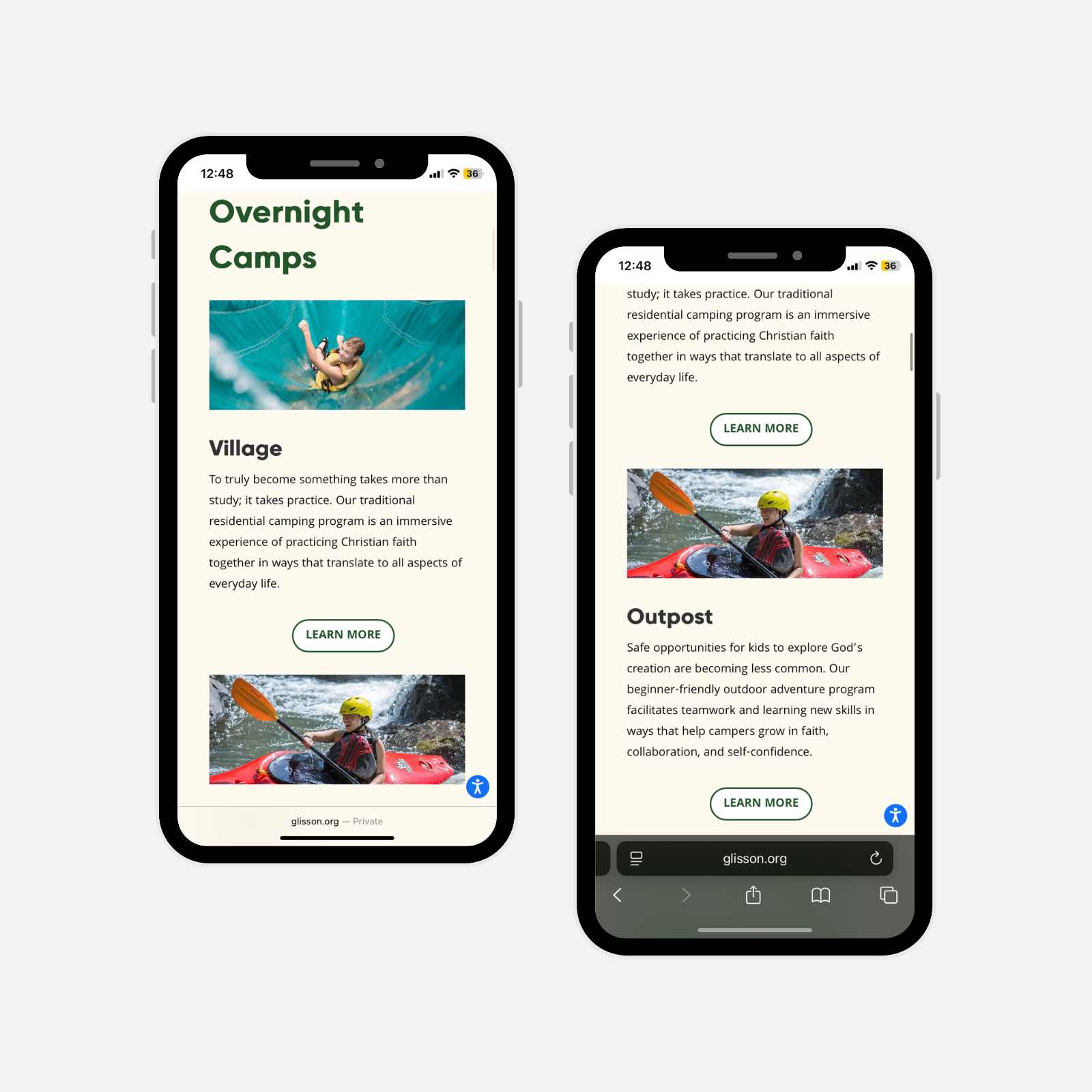
We created distinct landing hubs for Village, Outpost, and Sparrowwood camps that function as standalone experiences with specific video loops and targeted FAQs. This was important because users previously struggled to understand the differences between programs, often confusing "Outpost" with "Village."
Program Sub-Landing Pages
We created distinct landing hubs for Village, Outpost, and Sparrowwood camps that function as standalone experiences with specific video loops and targeted FAQs. This was important because users previously struggled to understand the differences between programs, often confusing "Outpost" with "Village."
Browsing Before Comitting
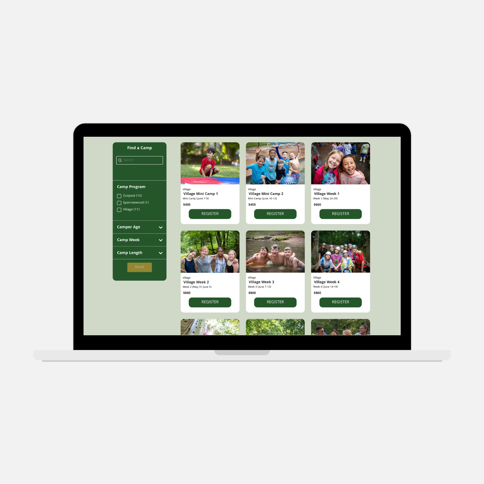
To help parents explore options before committing to registration, we introduced a filterable camp directory: allowing families to browse available sessions by camp, camper age, camp week, and camp length. This gives parents a clearer overview of what's available for their child upfront. Camp session descriptions are planned as a future iteration to add deeper context for each option.
Browsing Before Comitting
To help parents explore options before committing to registration, we introduced a filterable camp directory: allowing families to browse available sessions by camp, camper age, camp week, and camp length. This gives parents a clearer overview of what's available for their child upfront, reducing uncertainty before they ever reach the registration system. Camp session descriptions are planned as a future iteration to add deeper context for each option.
The Mega-Menu Difference
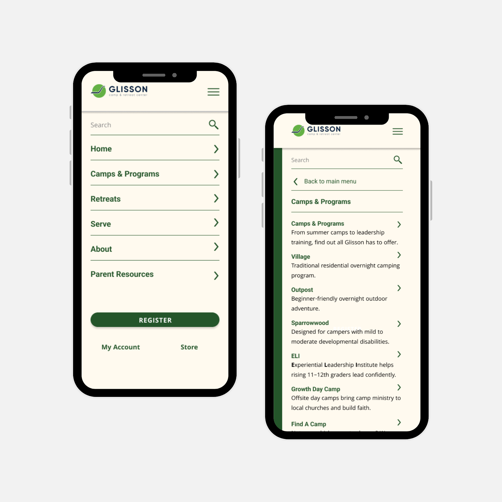
With overnight, day, special needs, and externally-hosted camps spanning different age ranges, program confusion was inevitable. In the updated menu, each item was paired with a single clarifying description to guide parents toward the right fit before they clicked anything.
The Mega-Menu Difference
With overnight, day, special needs, and externally-hosted camps spanning different age ranges, program confusion was inevitable. In the updated menu, each item was paired with a single clarifying description to guide parents toward the right fit before they clicked anything.
- Final Design -
The Results
The redesign addressed the primary friction points within a defined scope and budget (with the third-party registration system remaining a known handoff point outside our control). Future iterations include adding camp session descriptions and a dynamic camp schedule to deepen the browsing experience before parents reach registration.
Exploring Before Enrolling
The camp filter emerged as the top clicked element on the programs page with a 16.51% CTR, indicating parents are actively using the browse experience to explore options before reaching registration.
Fewer Rage Clicks
A site-wide rage click rate of just 0.17% suggests the redesigned navigation is landing cleanly with users, directly addressing the confusion and friction that stakeholder research identified as a primary pain point
Reduced Program Confusion
A redesigned mega menu with program descriptions and distinct sub-landing pages for Village, Outpost, and Sparrowwood were introduced to address program confusion, with staff reporting fewer parent inquiries about program differences post-launch.
What I Learned
Audit Third-Party Systems Early
Fully understanding a third-party system's capabilities before design begins is critical. Discovering Circuitree's limitations mid-project meant some of the most impactful UX improvements couldn't be produced within budget, reinforcing that technical constraints should inform scope conversations from day one.
Scope It or Lose It
Some of the most valuable features were identified early but deprioritized due to time and budget. This project reinforced that phased delivery planning from the outset helps protect high-impact improvements when constraints inevitably tighten.
Designing Around Systems You Don't Own
Working alongside a fixed third-party registration system meant some friction points were outside our control. It sharpened my ability to design the best possible experience up to the handoff point and identify where future investment would have the greatest impact.
- Brand & Marketing Expansion -
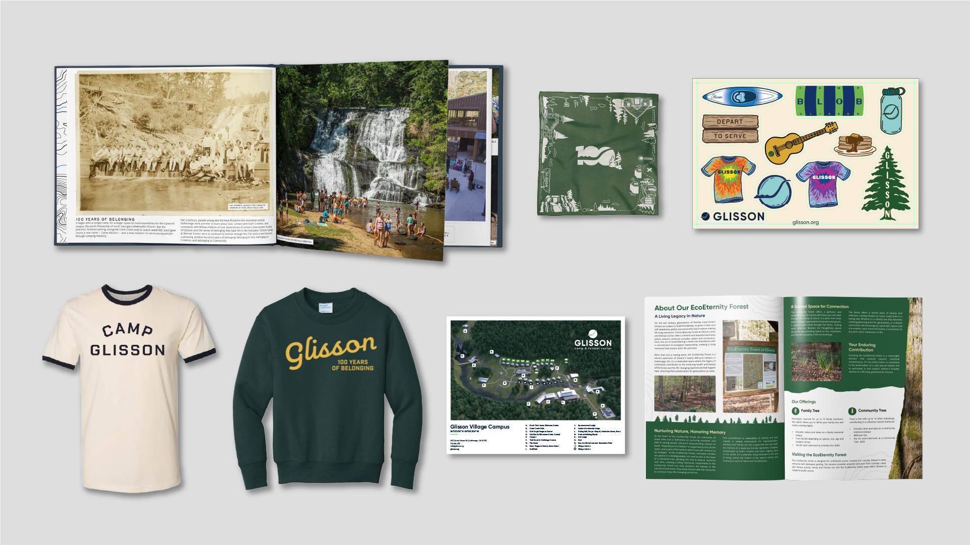
Extended Design System
In addition to the website, our team extended the brand system across a wide range of marketing, swag and internal materials. This included brochures, stickers, T-shirt designs and more.
More Case Studies
Mapping the Camper Journey
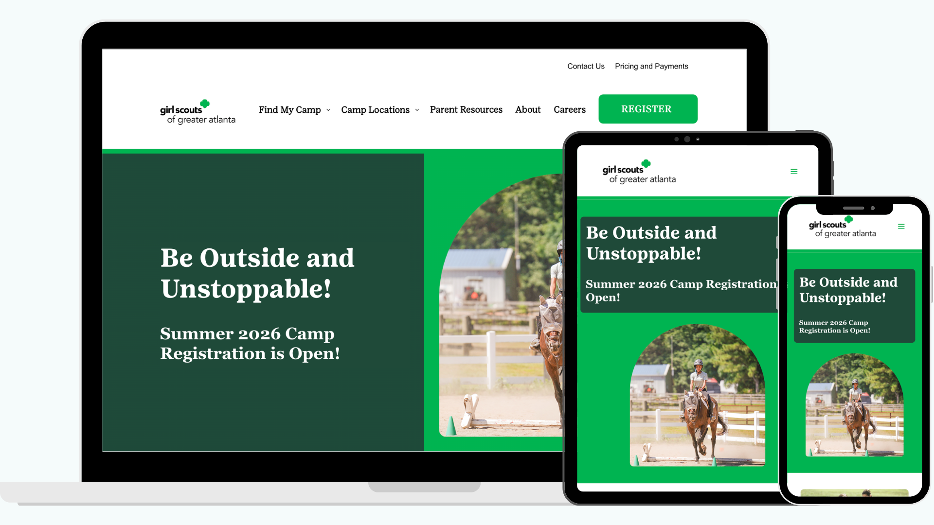
Designed a centralized, parent-friendly site that organizes camp options, logistics, and requirements, making it easy for families to explore, plan, and register with confidence.
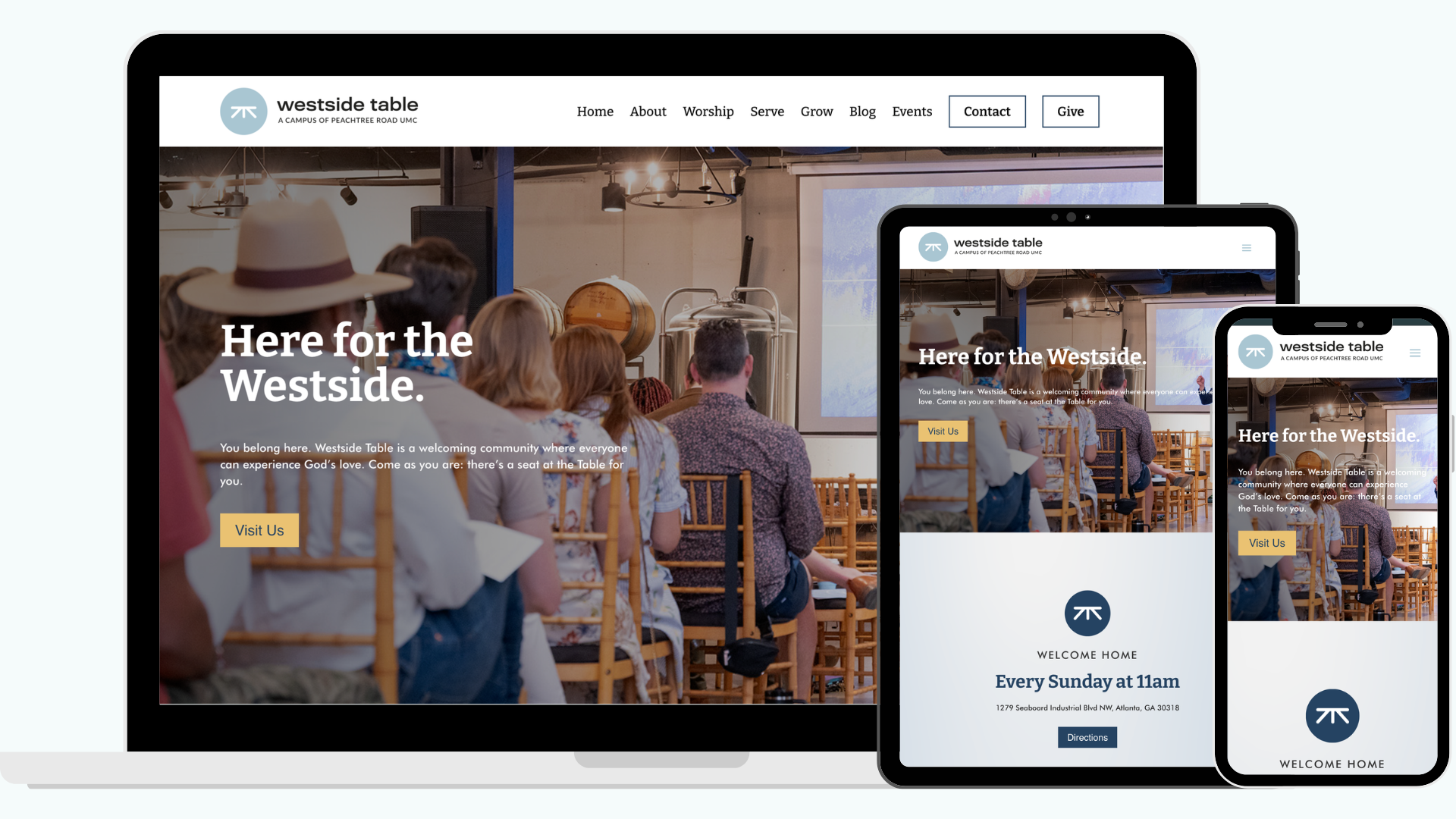
A Digital Front Porch for a Church in a Brewery
Redesigned Westside Table's website to create clear, approachable pathways that help hesitant visitors feel connected and confident engaging with the church in person.